Overview

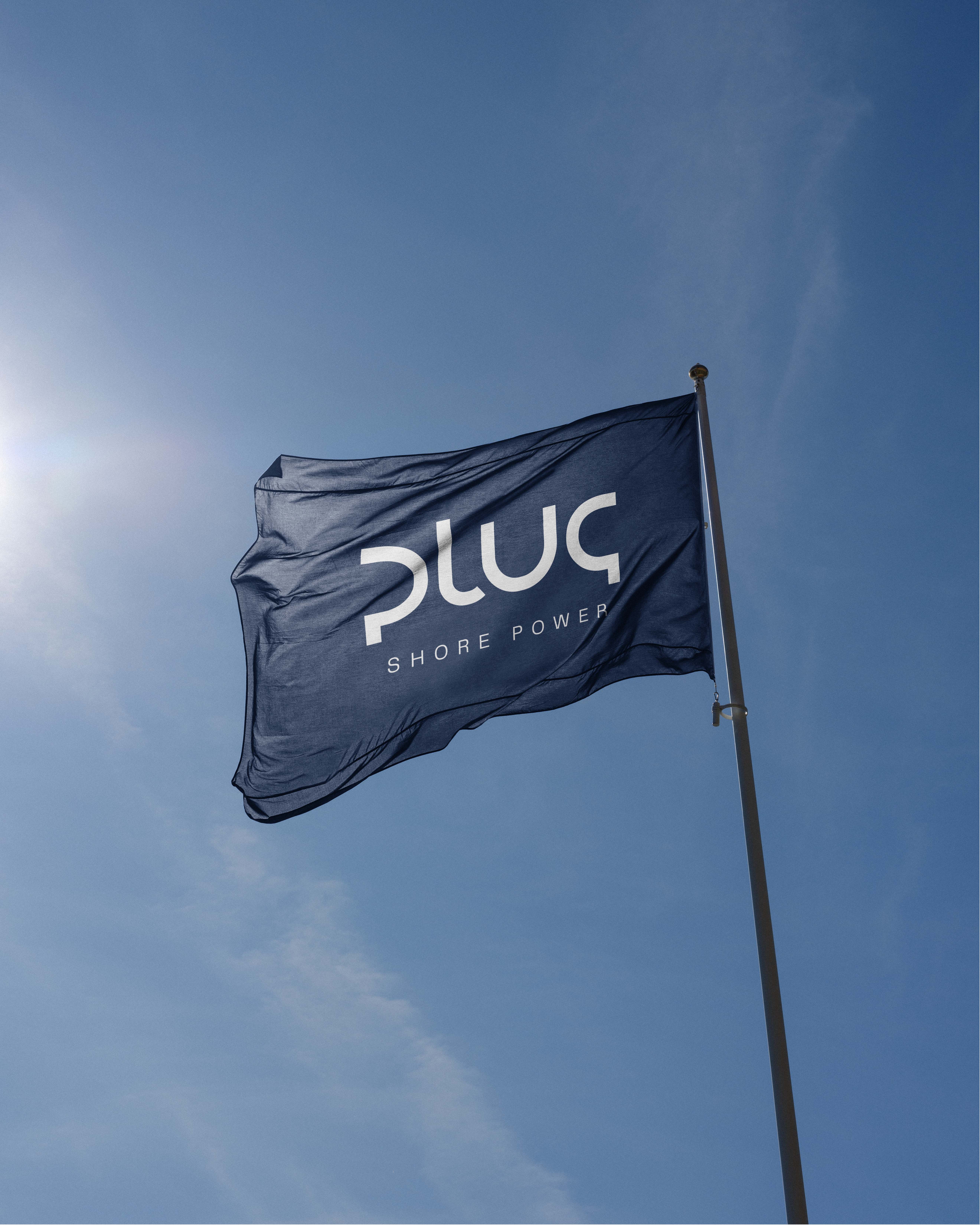
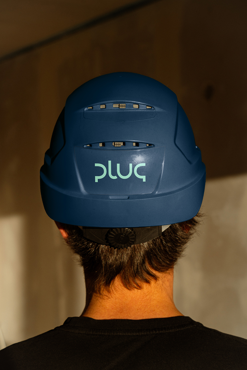
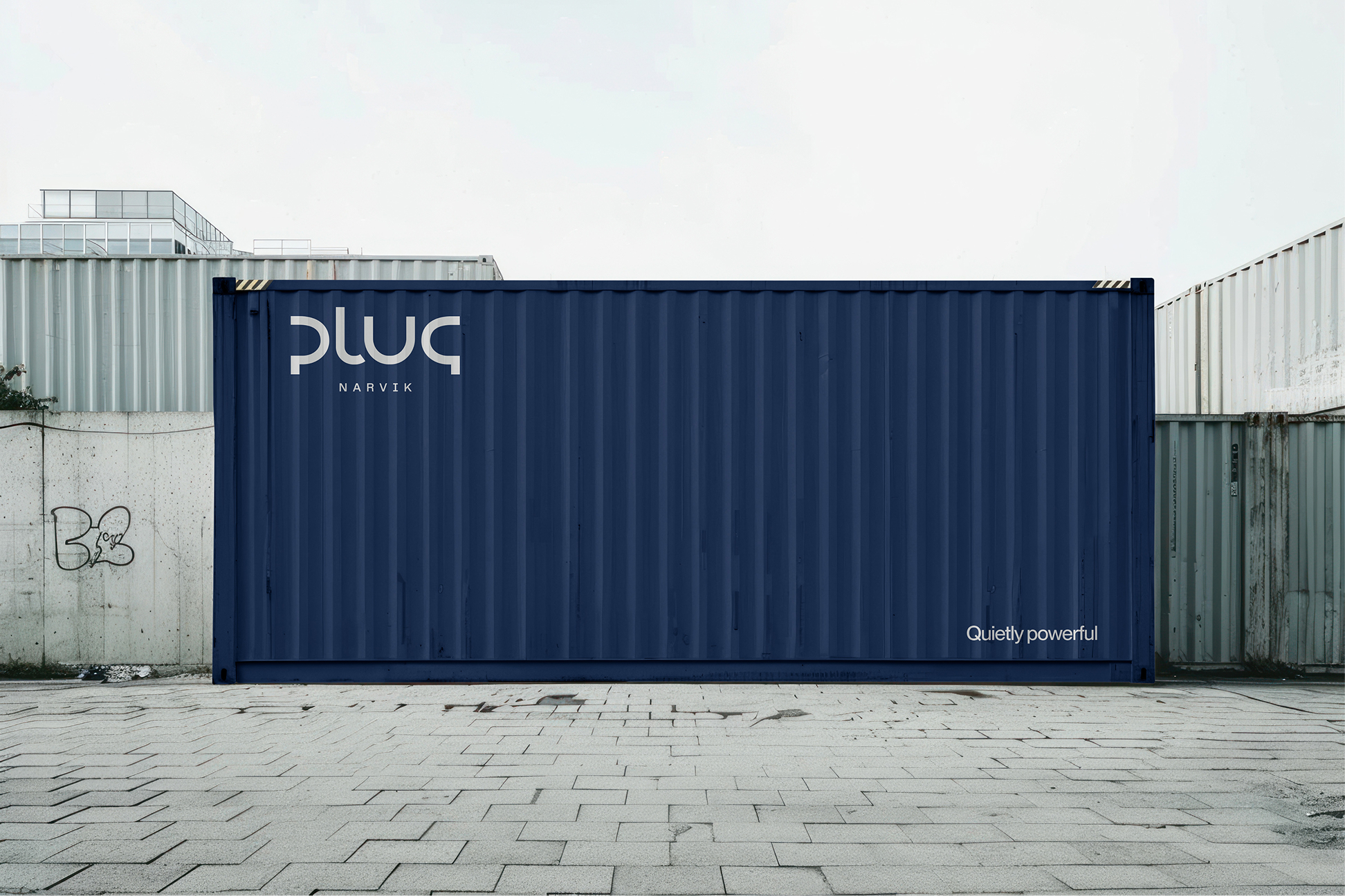
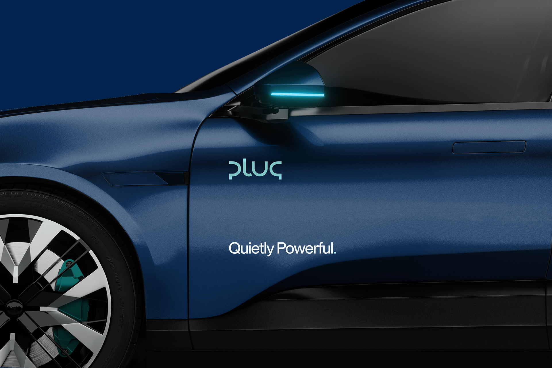
Plug’s applications translate the brand into real environments and materials. Layout, color, typography, and logo usage must function as one structured system. The visual expression should feel calm, precise, and engineered rather than expressive or ornamental. White space is used intentionally to create clarity and hierarchy, ensuring complex information remains understandable. Every element must serve a clear purpose. If it does not strengthen clarity, structure, or trust, it should not be included.

Dark blue flag with white text 'plug SHORE POWER' waving against a clear blue sky with the sun shining.
Hand holding a white baseball cap with the text 'PLUG SHORE POWER' against a clear blue sky.
Baksidebilde av en person som bruker en blå hjelm med logoen "plug" i grønt.
Blue shipping container with the text 'pluq Narvik' and 'Quietly powerful' on an industrial concrete and metal background.
Side view of a dark blue electric car door with illuminated side mirror and text reading 'plug' and 'Quietly Powerful.'
Outdoor advertisement near a waterfront showing a blue poster with text promoting a sustainable city and shore power system.
Advertisement poster displaying a serene blue waterway between dark cliffs with text promoting clean and quiet shore power systems.
Hands holding an open magazine displaying an article about clean power and shore power infrastructure with photos of ships and port facilities.
Close-up of a letterhead titled 'Annual report' with text about building and operating shore power infrastructure for ports, placed on a dark textured surface.