Layouts
Overview
Plug’s key visuals are built to communicate reliability, scale, and long-term presence.
Layouts, color, typography, and logo usage work together as a single system. The visual language should feel calm, intentional, and engineered rather than expressive or decorative. White space is used generously to create clarity and hierarchy, allowing complex infrastructure and information to feel understandable.
Every element must serve a purpose. Visuals should guide attention, support the message, and reinforce trust. If an element does not improve clarity or understanding, it should be removed.
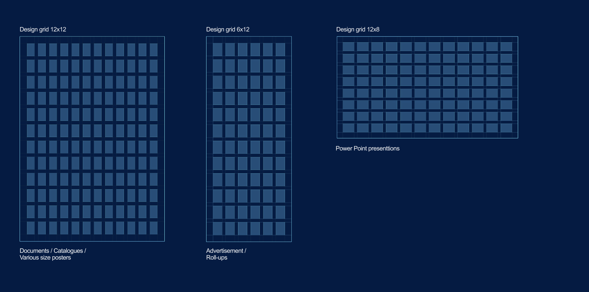
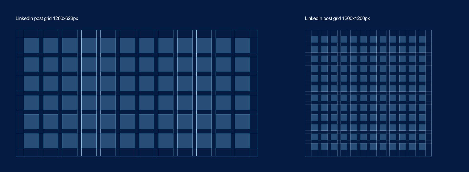
Grid System
The grid system is flexible and easy to apply for both print and digital applications. It allows freedom of design without compromising the consistency of the look and feel.
For print and digital materials grid system is based on a responsive and flexible 12x12 grid with a corresponding margin and gutter.
For special or extreme formats the grid is simplified to a 6x12 or 12x6 grid.For Power Point presentations grid is set for12x8 for maximum usability.
The margin is always a % of the shortest format edge (except for the Power Point format)
Margin = 5%
Gutter = 2,5%

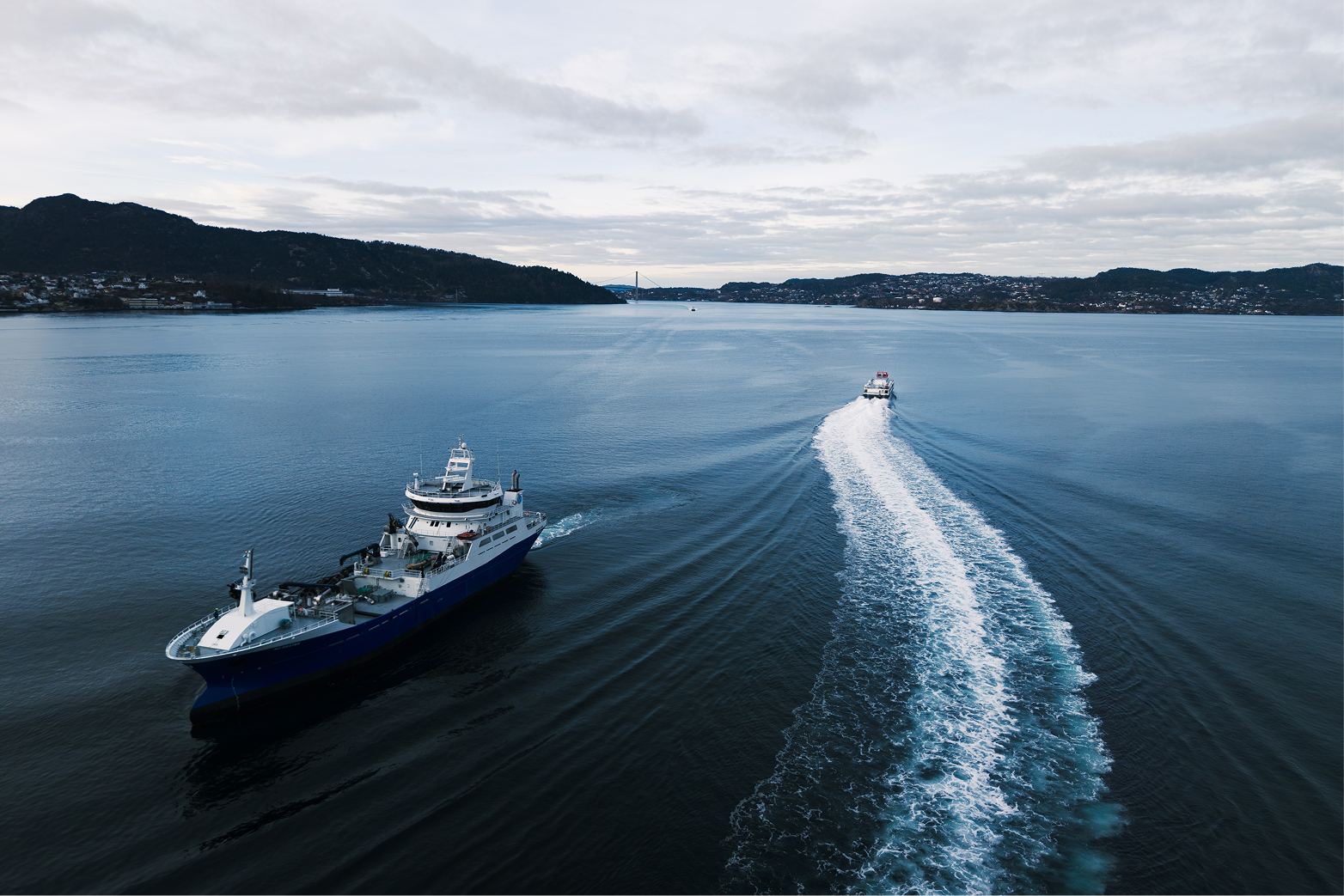
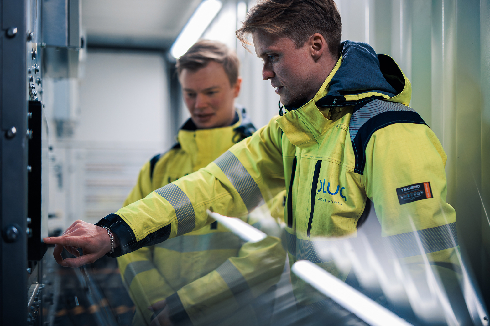
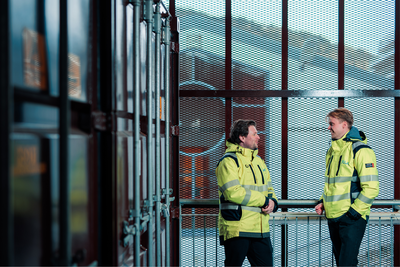
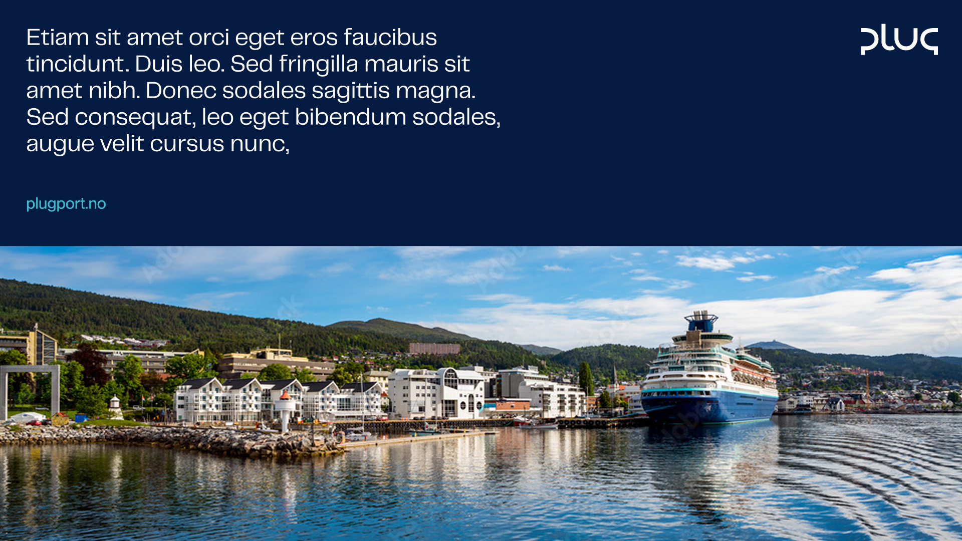
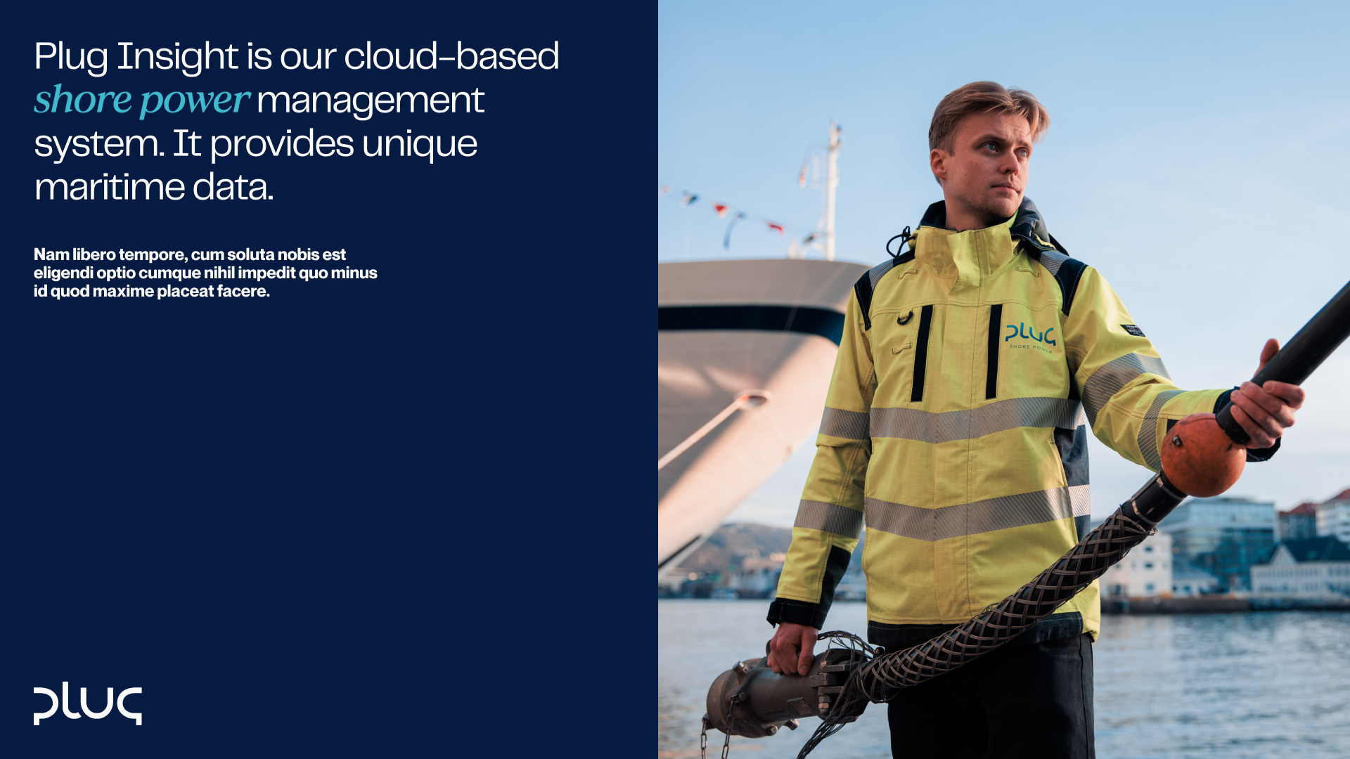
Photography
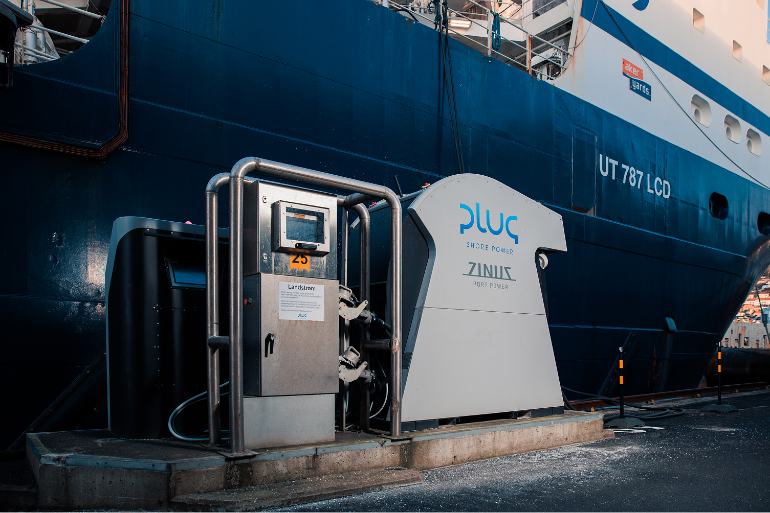
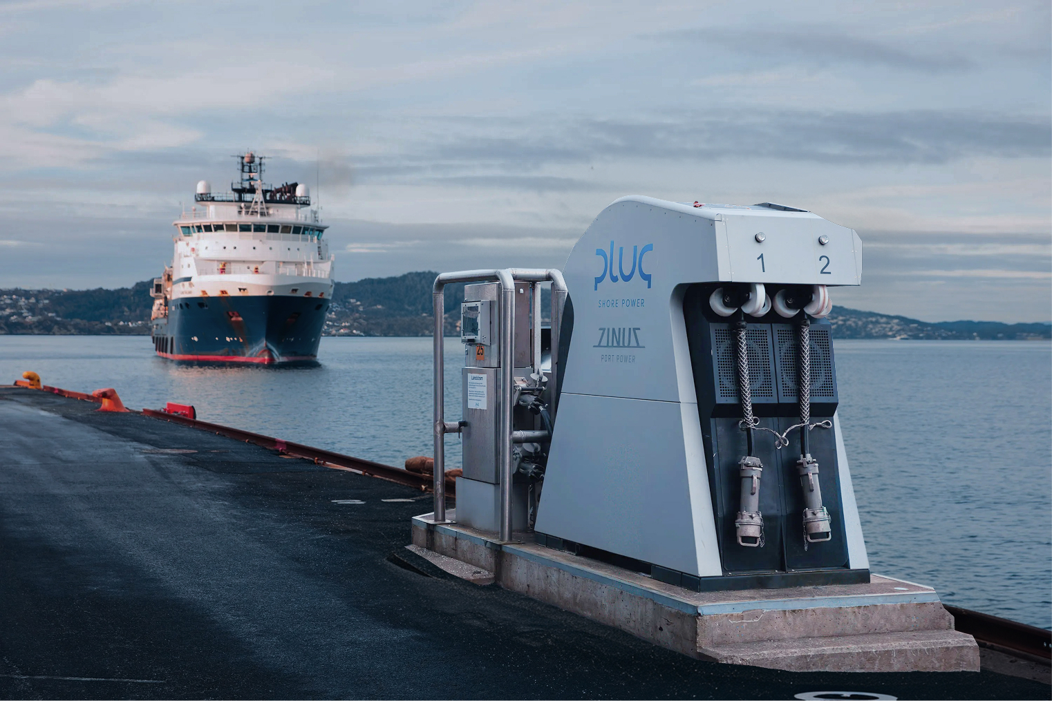
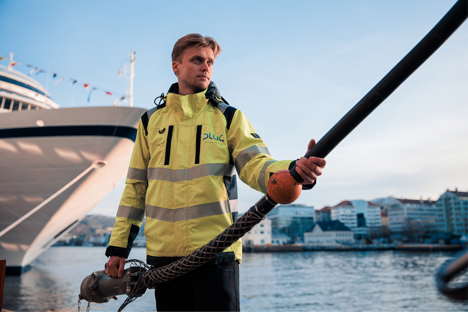
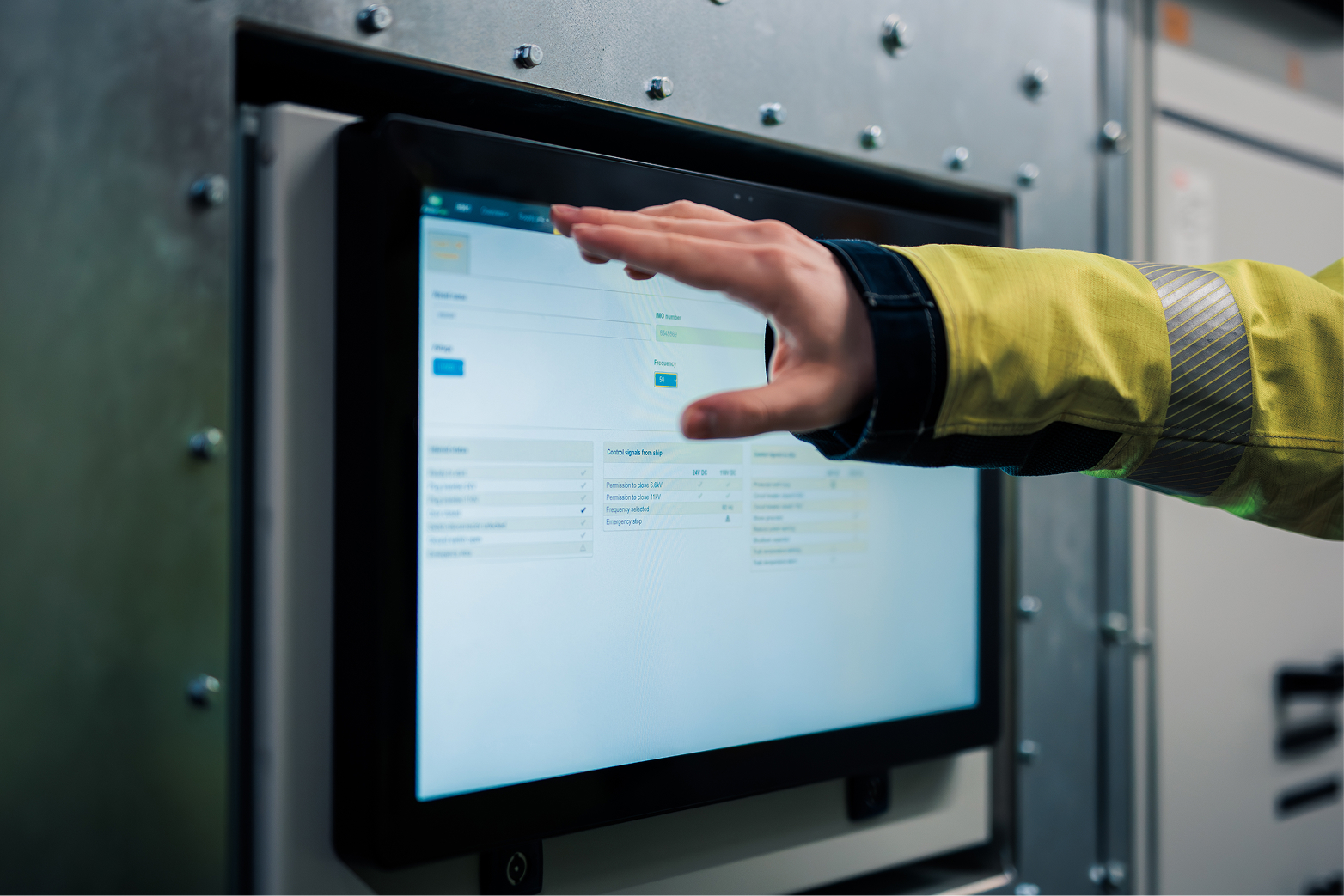
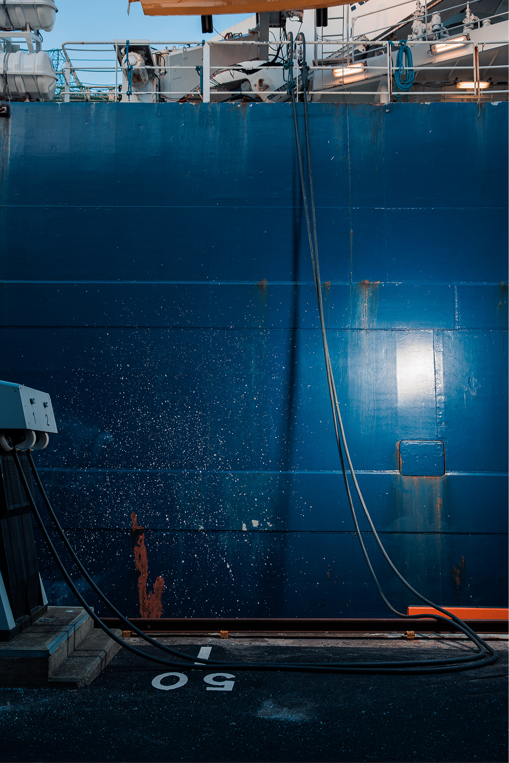
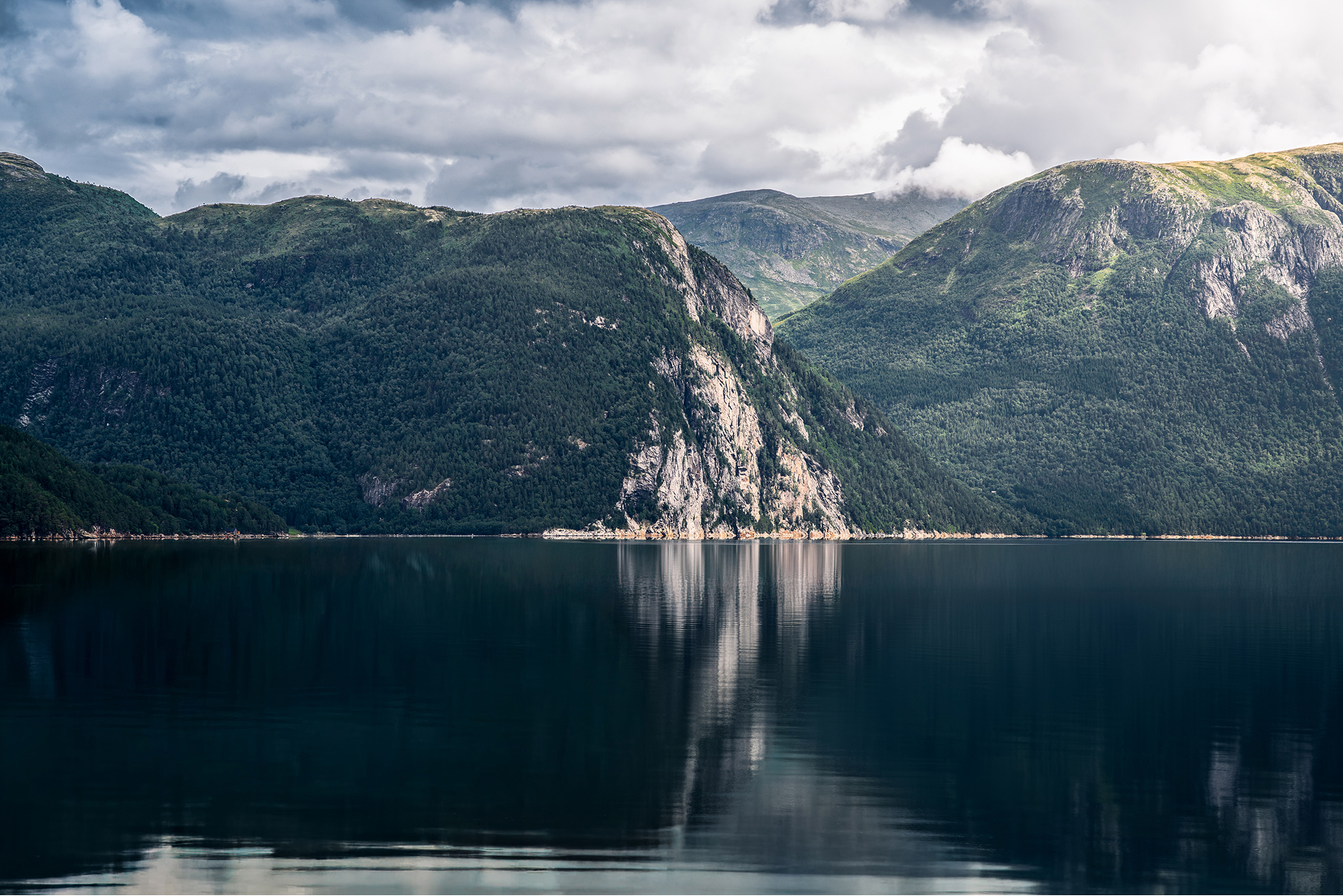
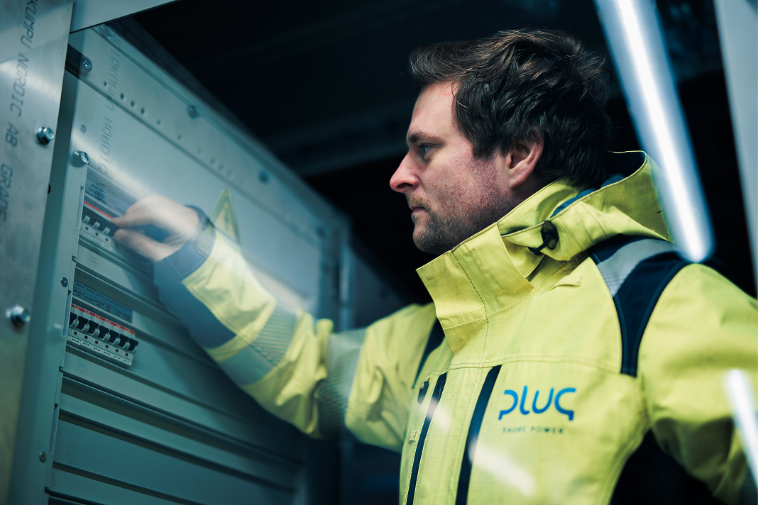
Photography should feel real, calm, and grounded in reality.
Images should communicate scale, infrastructure, and operational presence. Natural light, muted tones, and honest moments are preferred over staged or overly polished scenes. Ports, vessels, equipment, and people should be shown as they are, in real working environments.
Avoid stock-like imagery, dramatic effects, or heavy filters. Photography should leave room for typography to breathe and support the message without competing with it. Subtlety builds credibility.


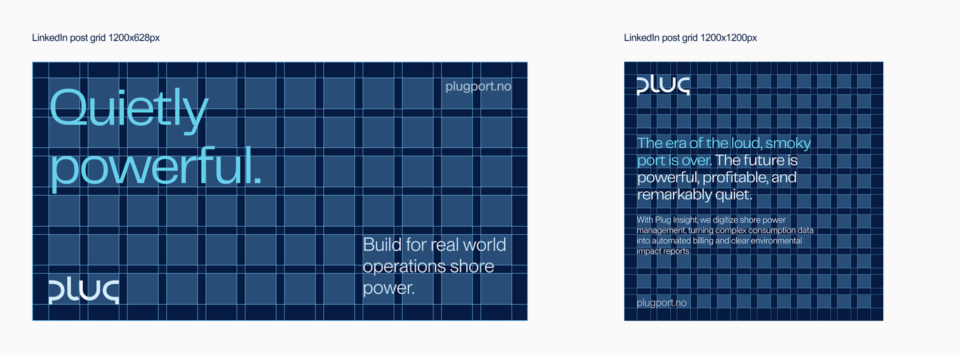
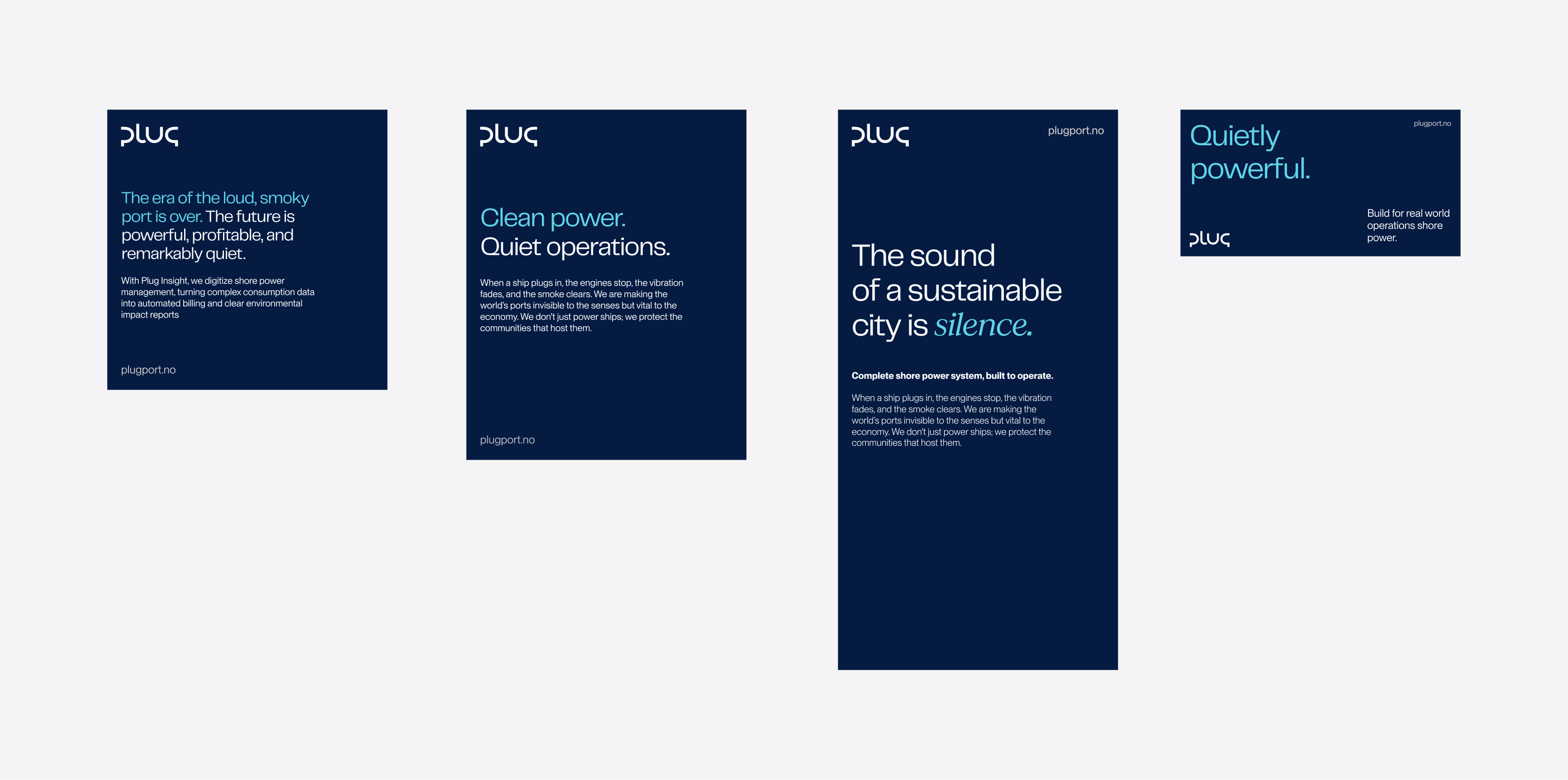
Social media
Communication on social media should be clear, focused, and purposeful.
Each post should communicate one message at a time, supported by strong imagery and simple layouts. Consistency across formats is more important than visual variation. The feed should feel recognisable even when individual posts differ.
Color and graphic elements may be used to support the content, but never to overpower it. Social content should reflect Plug’s calm authority and long-term perspective, not short-term engagement tactics.
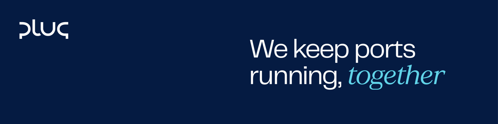


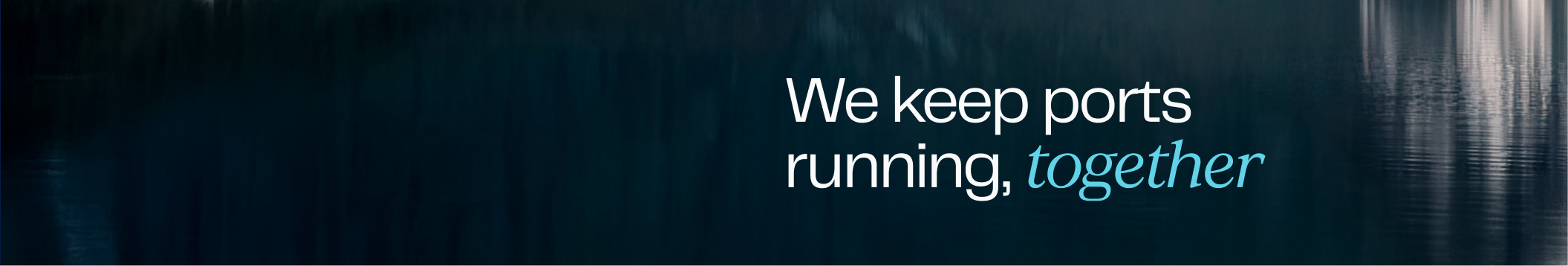


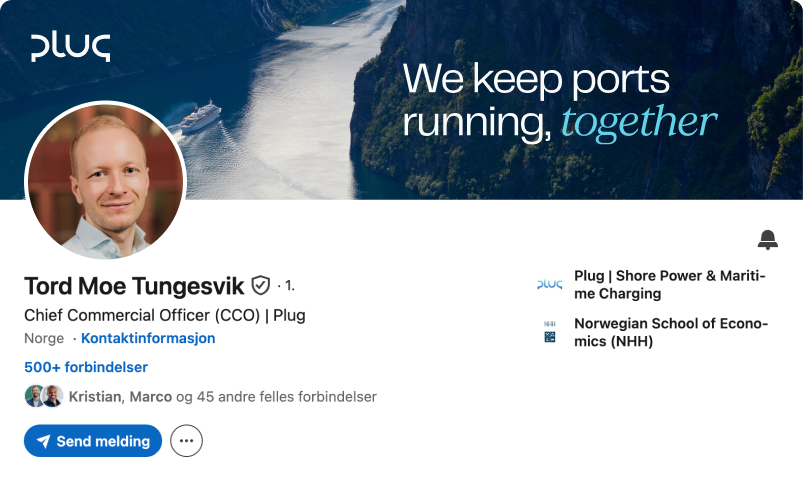
Linkedin employee profile banners
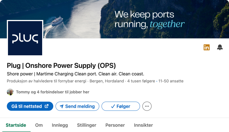
Linkedin company profile banners
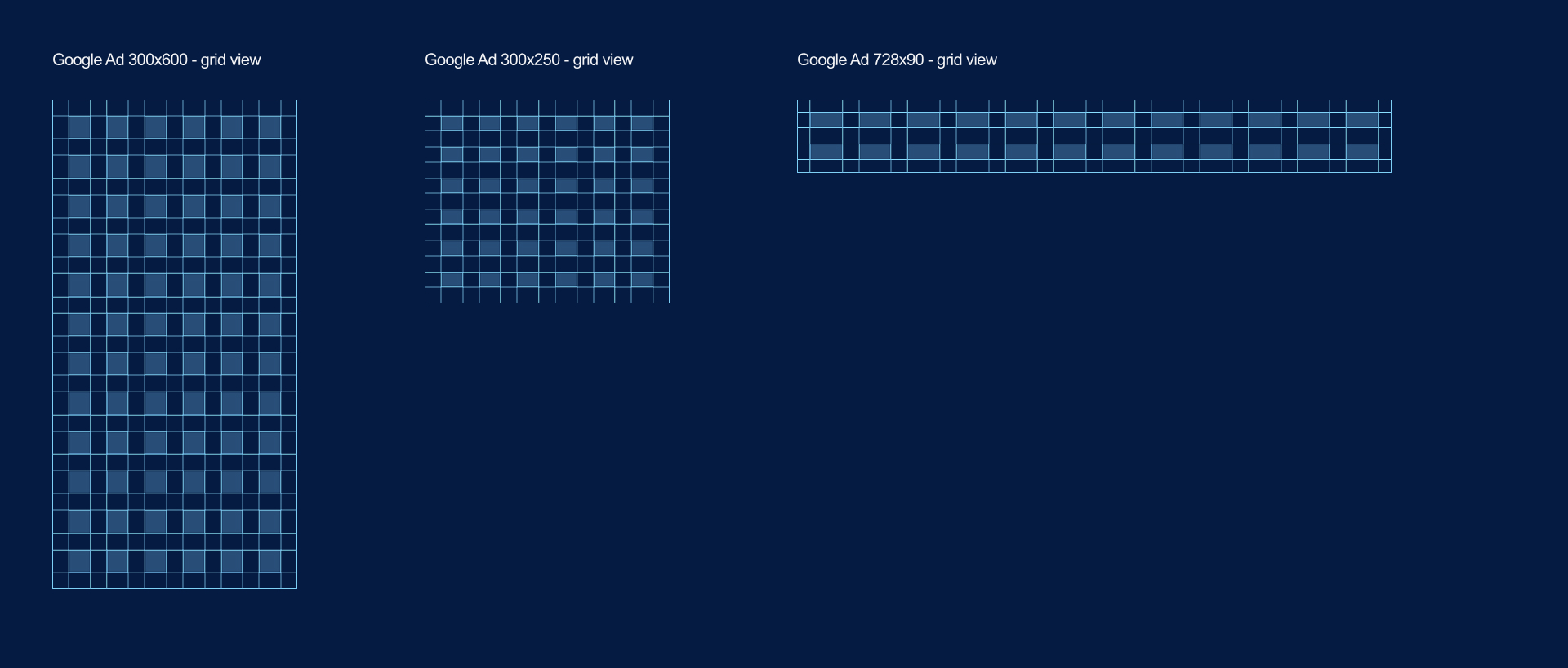
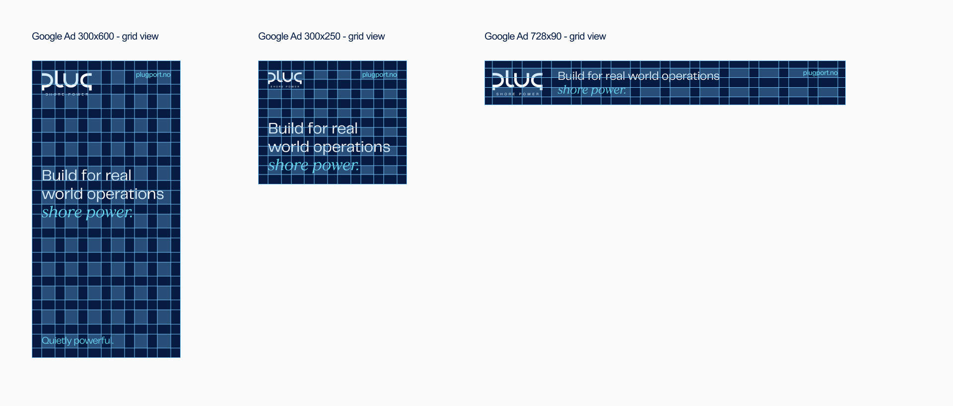
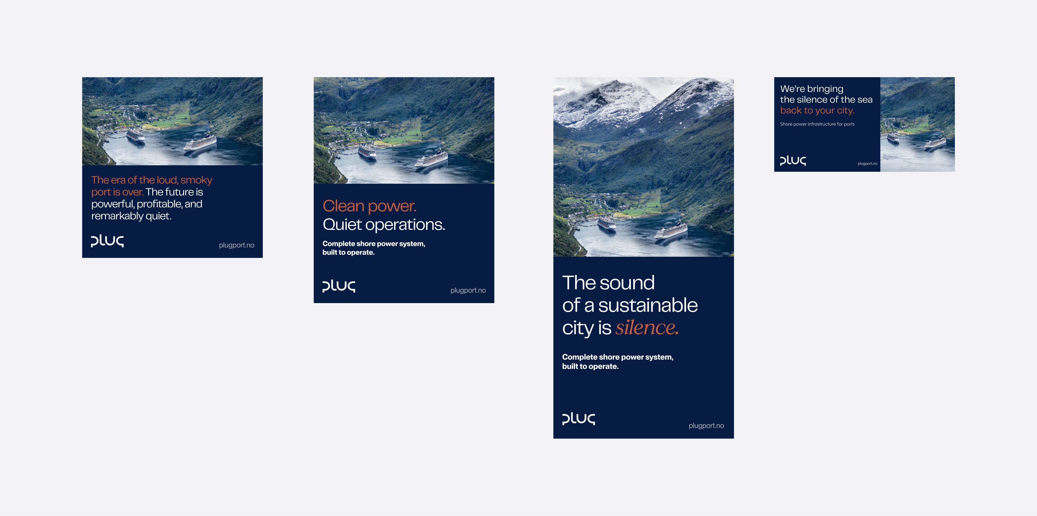
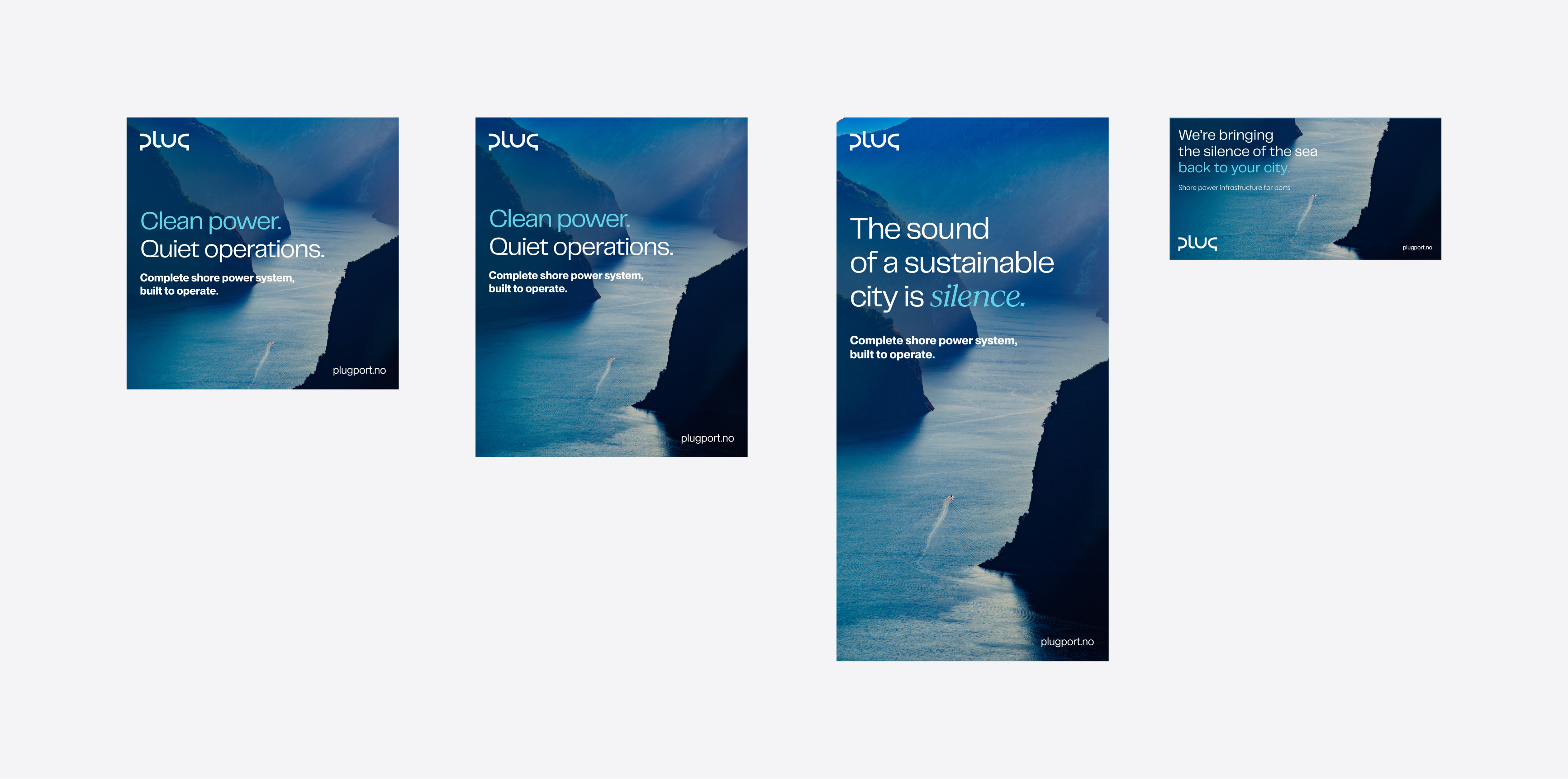
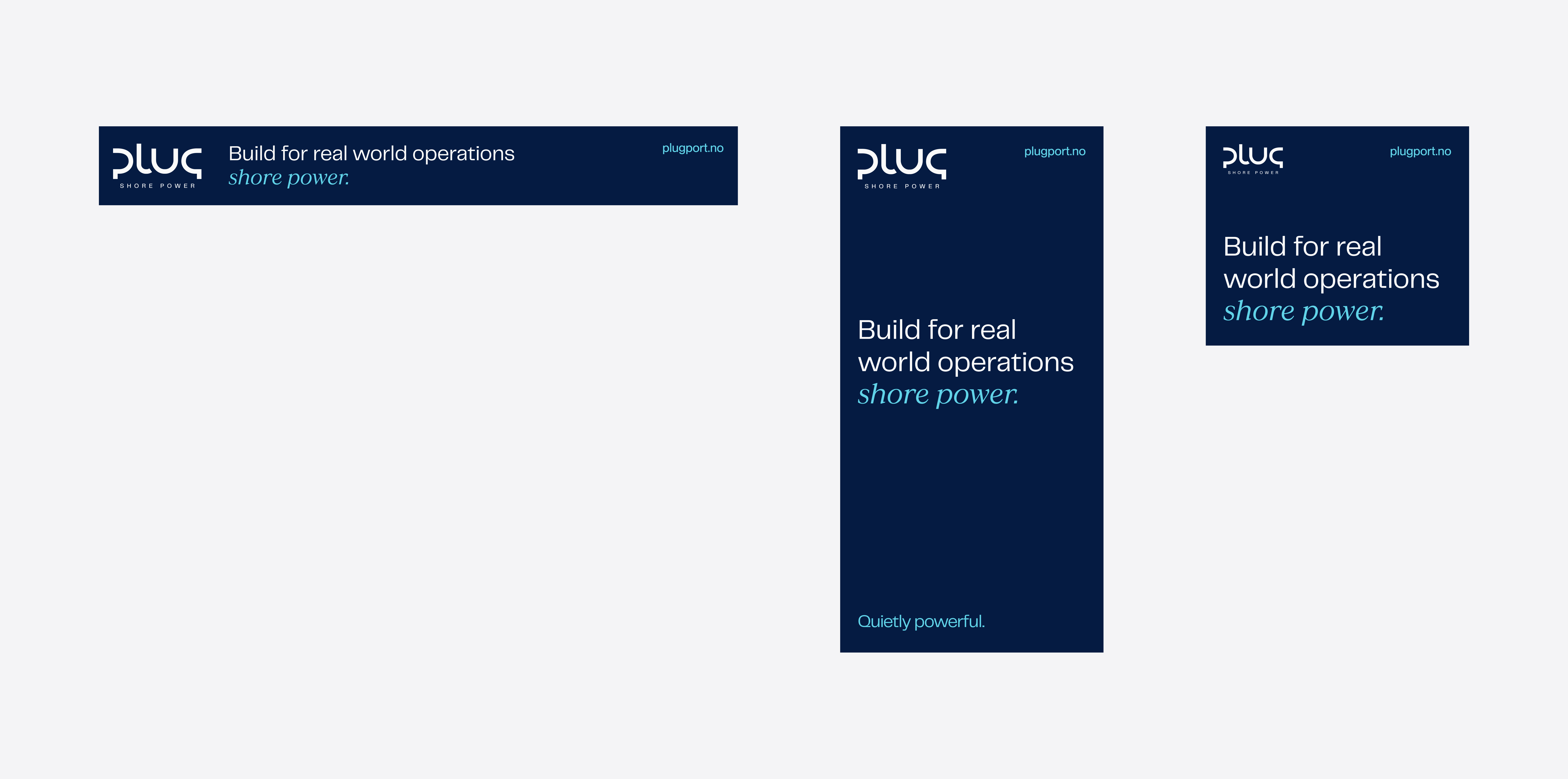
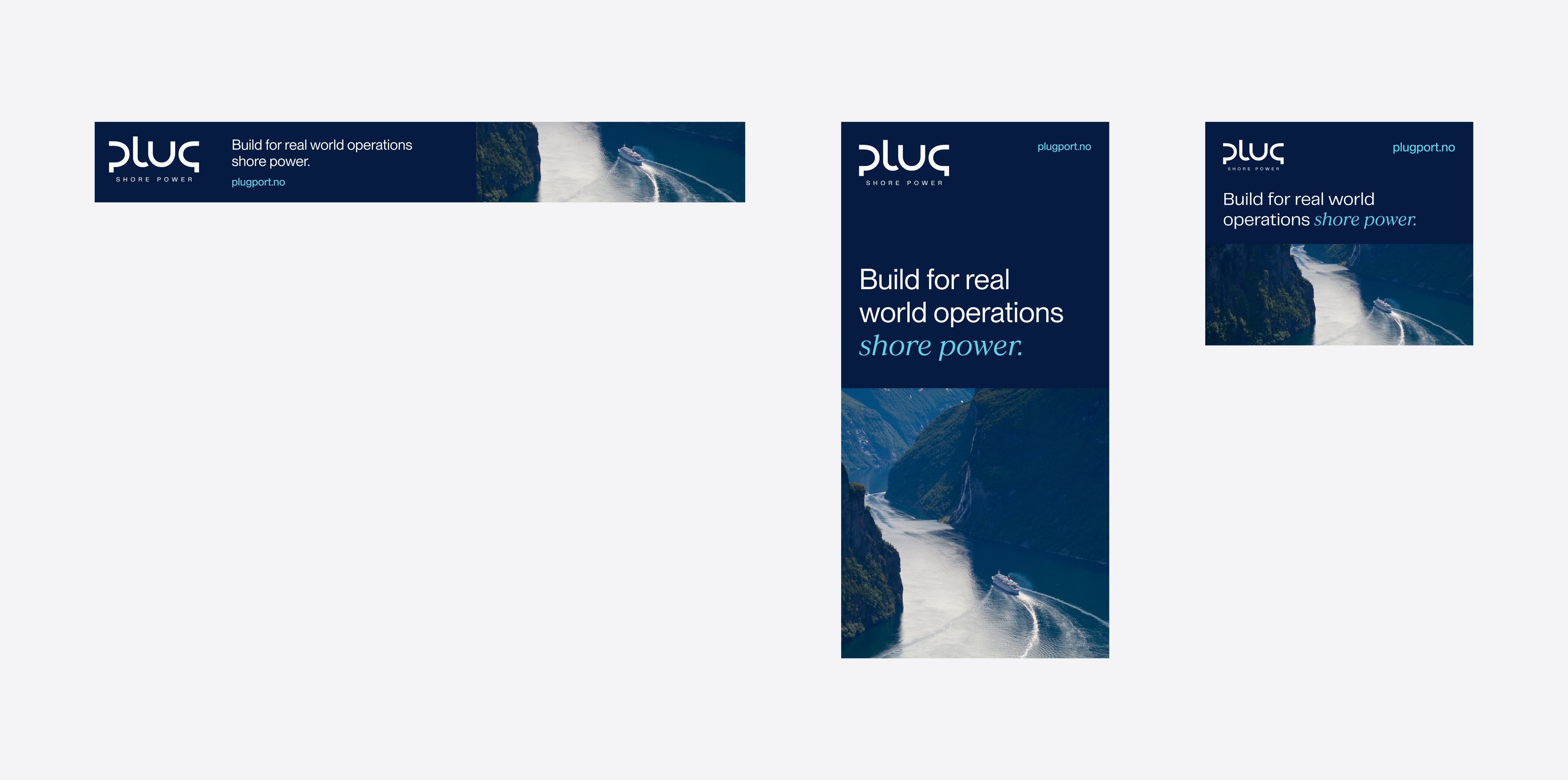
Google Ads
Advertising requires precision and restraint.
Layouts should prioritise clarity, contrast, and fast readability. Headlines must communicate value immediately and be supported by minimal, relevant supporting text. Calls to action should be clear but never aggressive.
Color should be used strategically and always within the brand palette. A calm, confident visual approach performs better over time than visual noise or exaggerated claims.
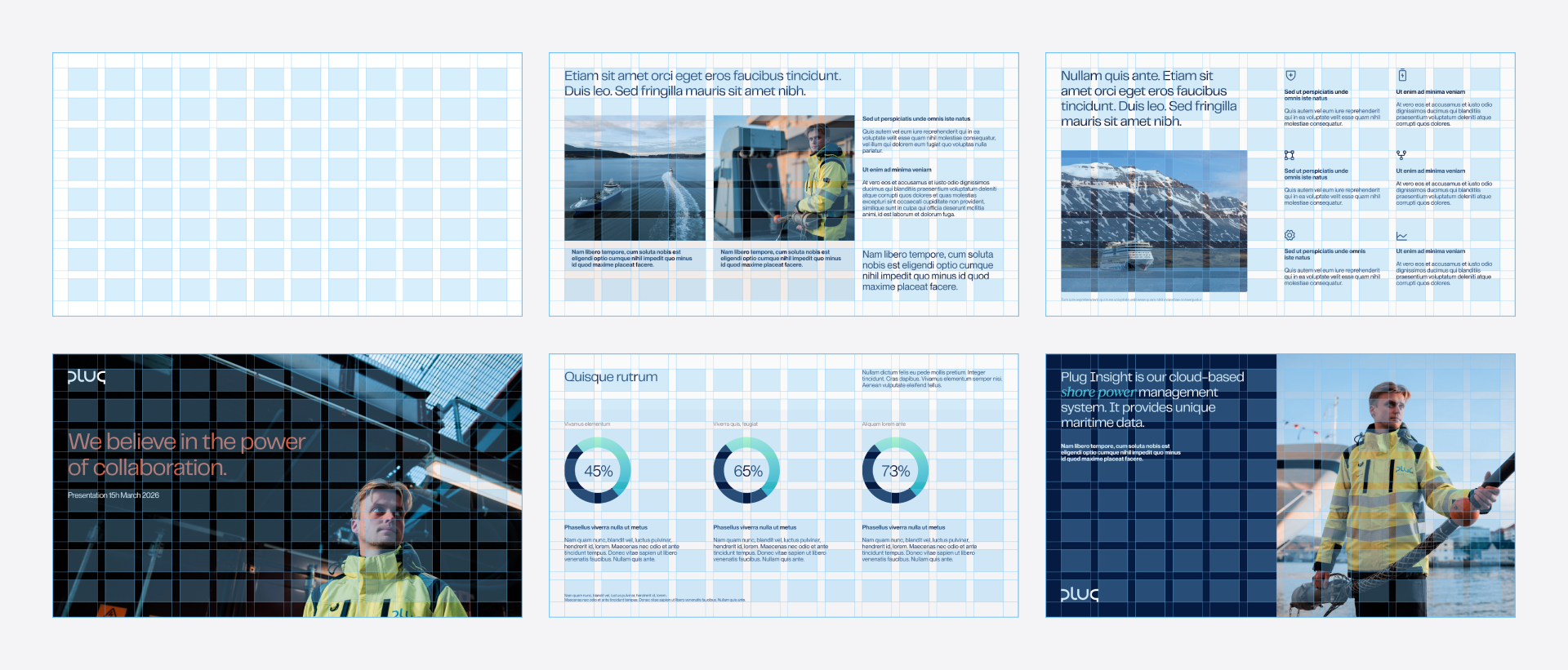
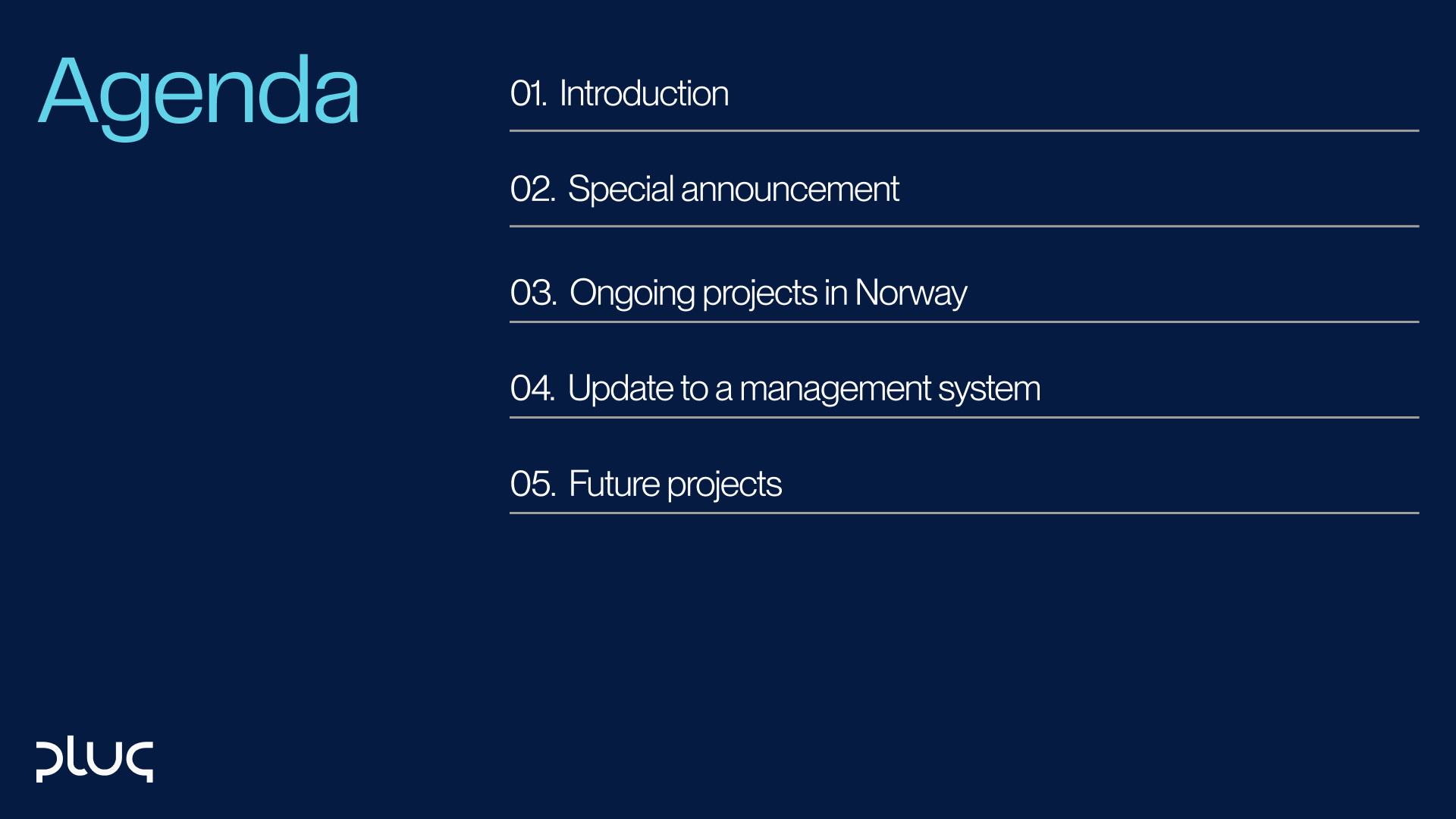
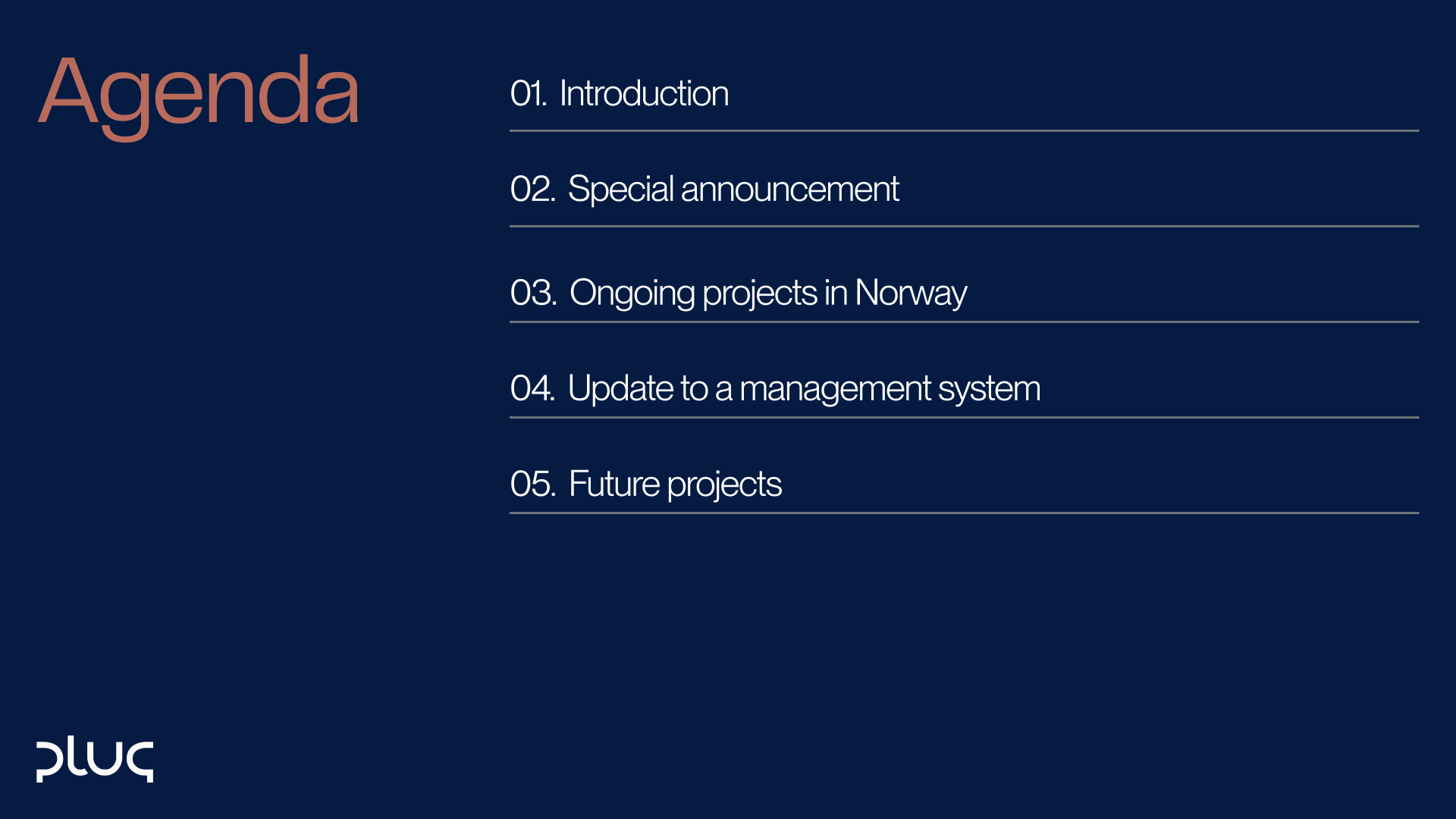
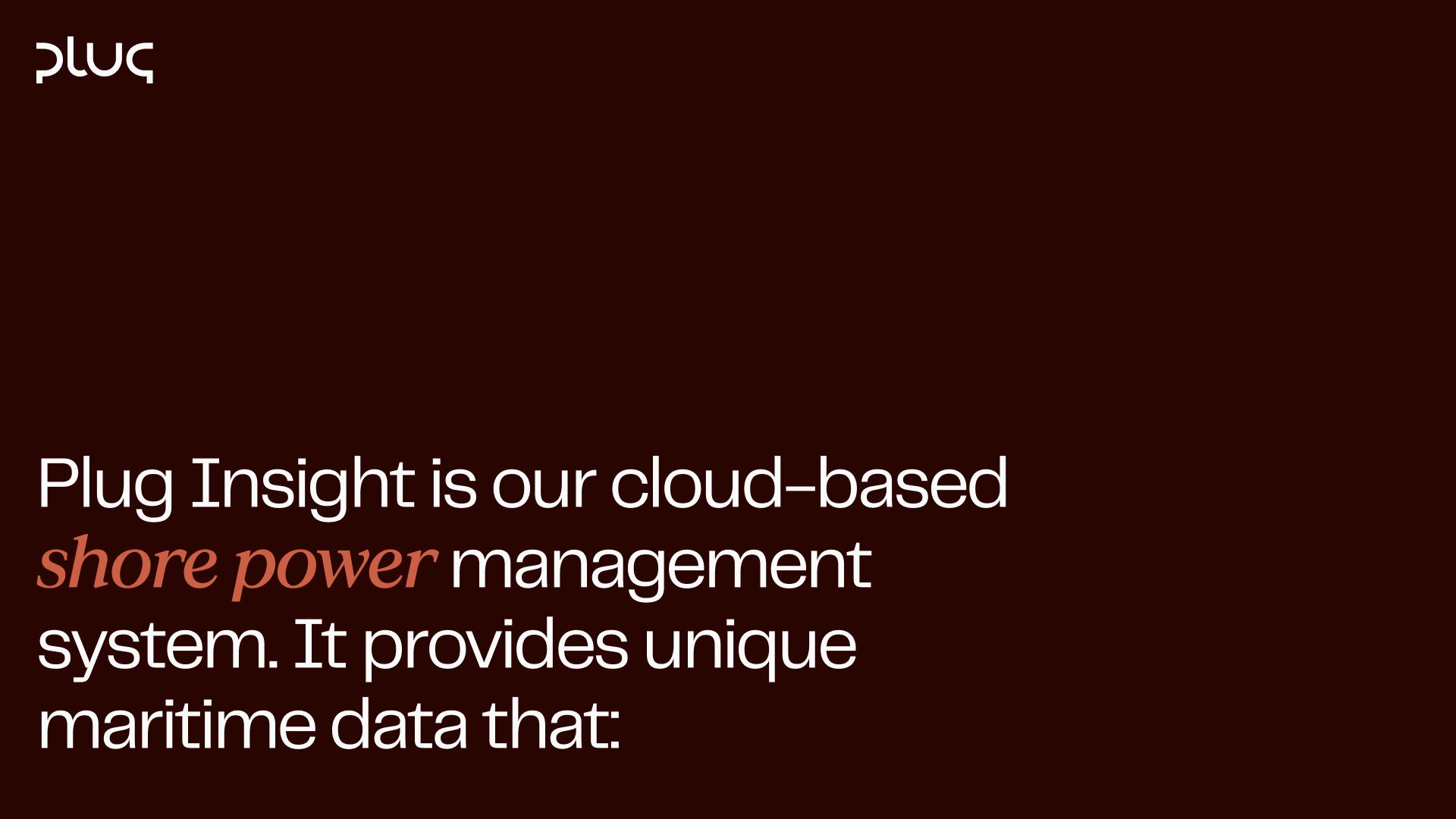
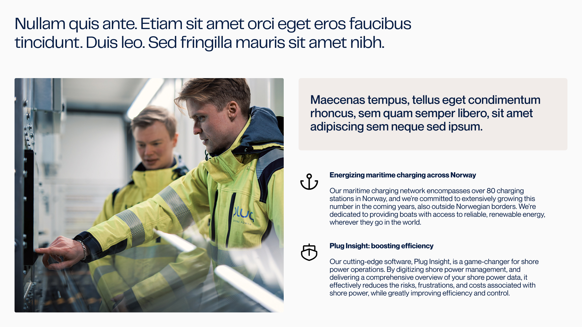
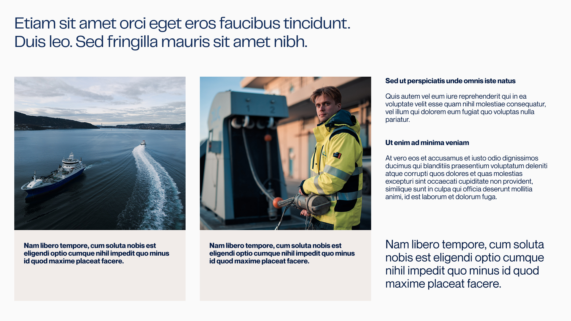
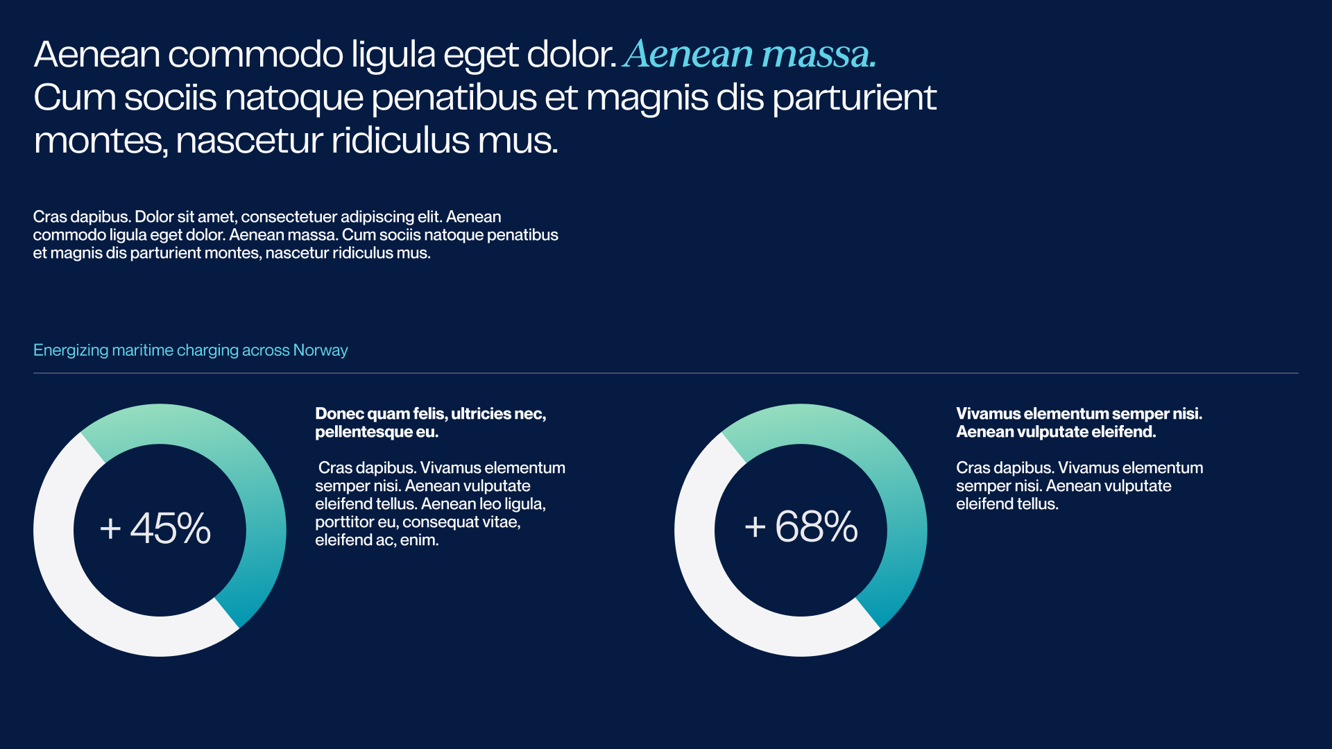
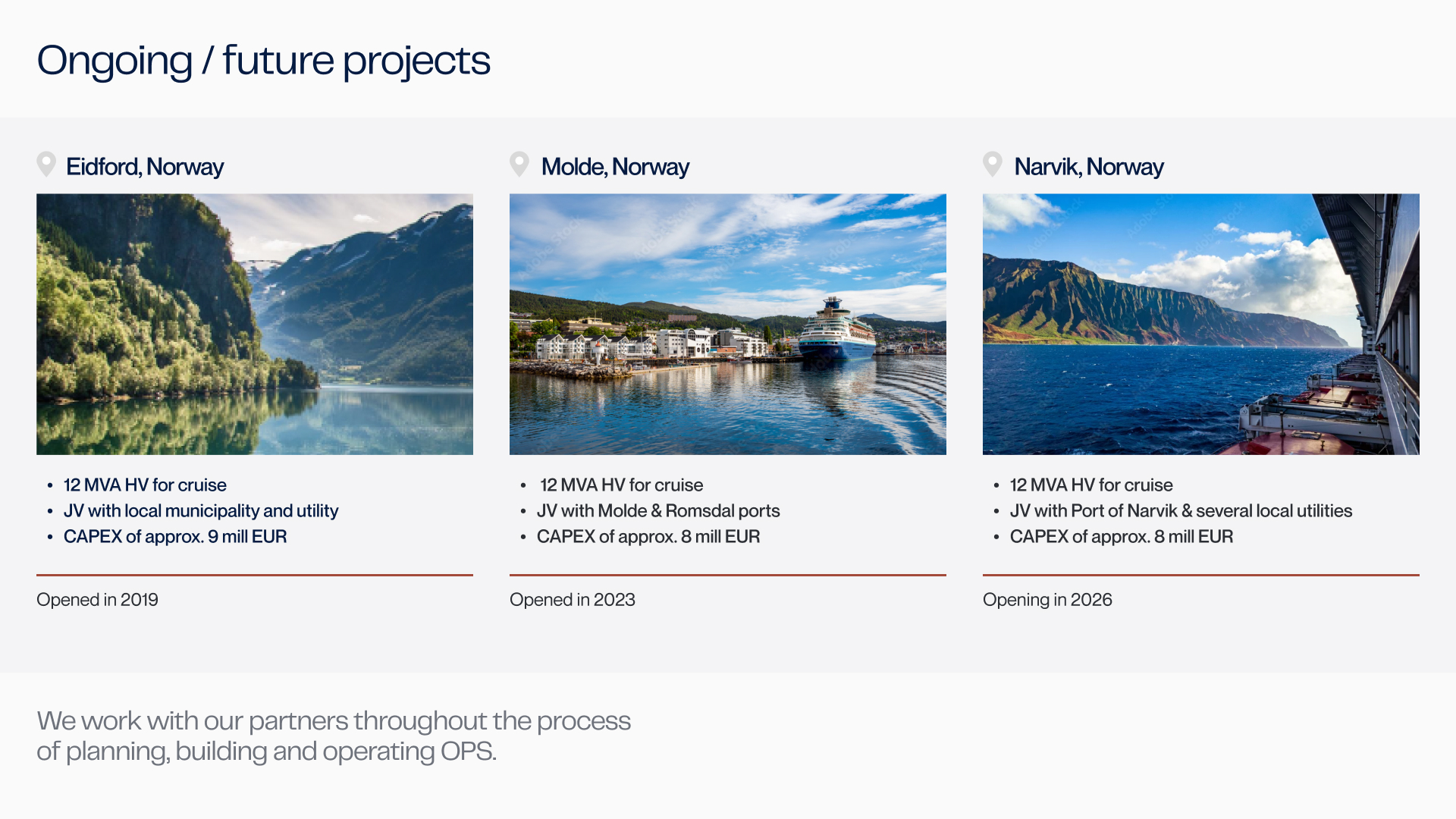
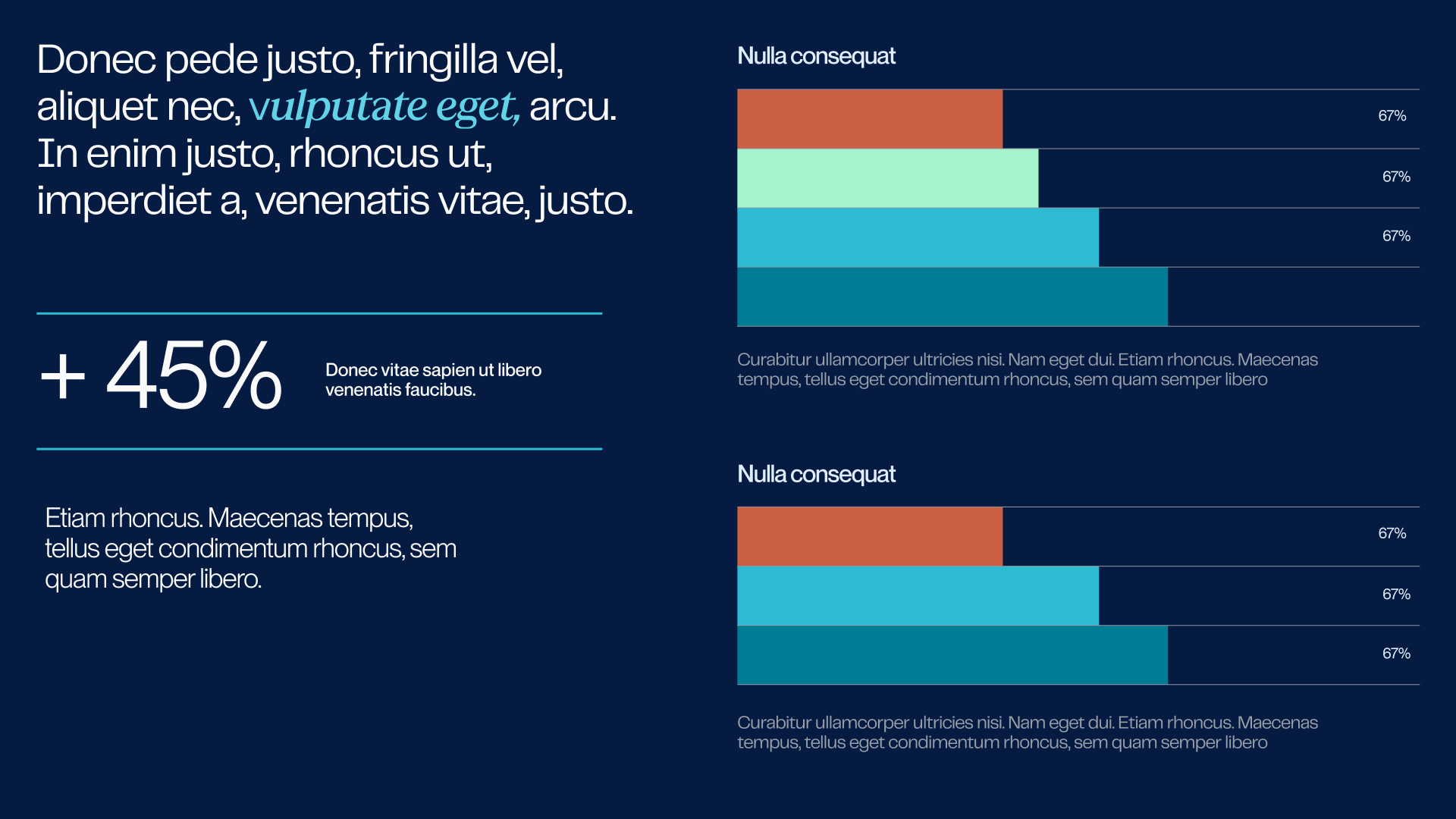
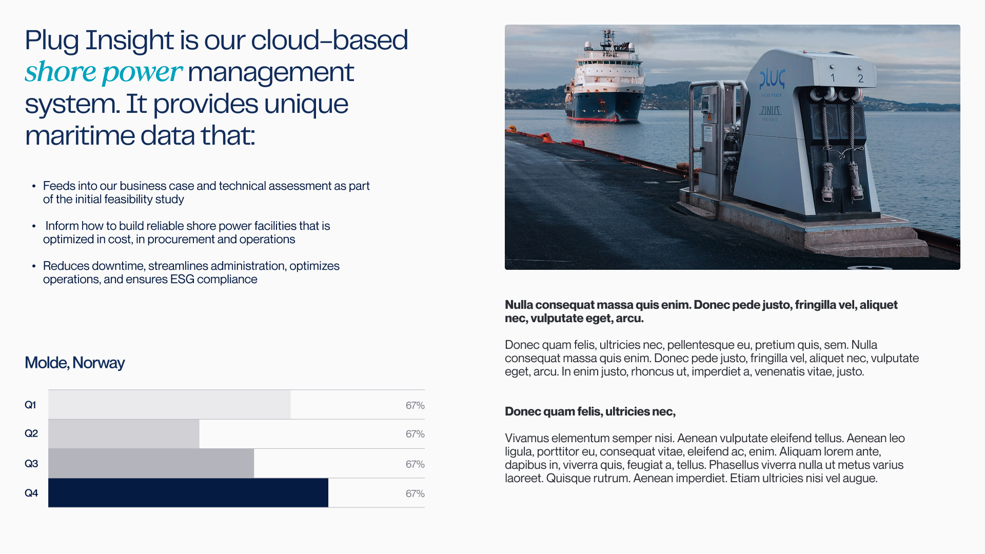
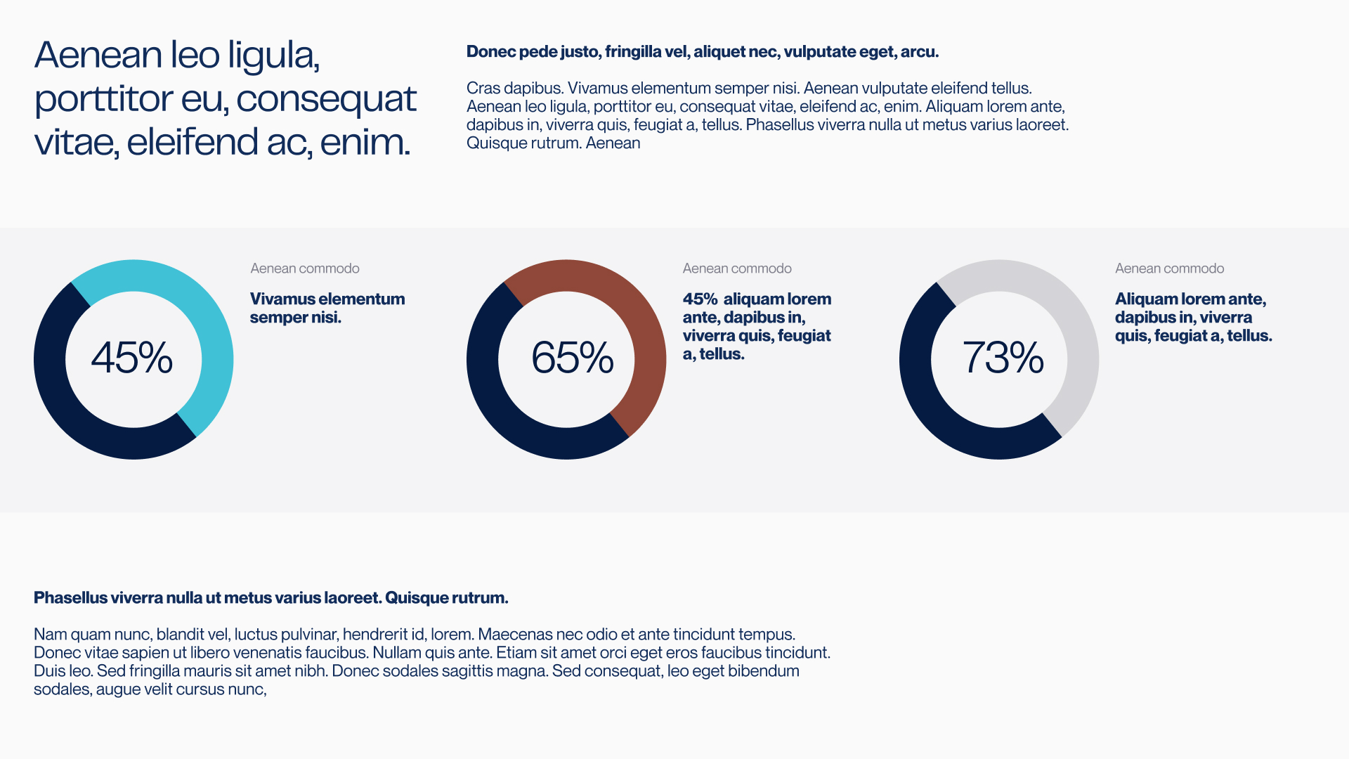
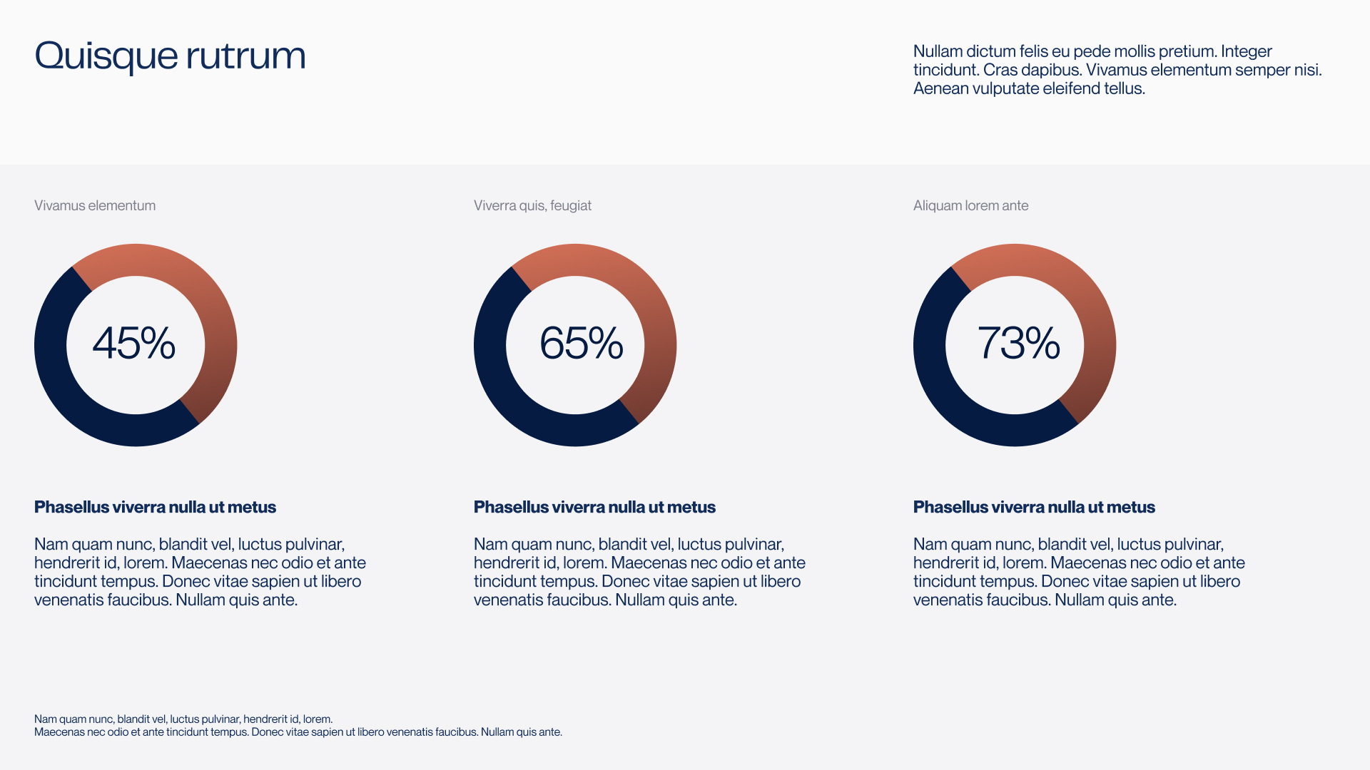
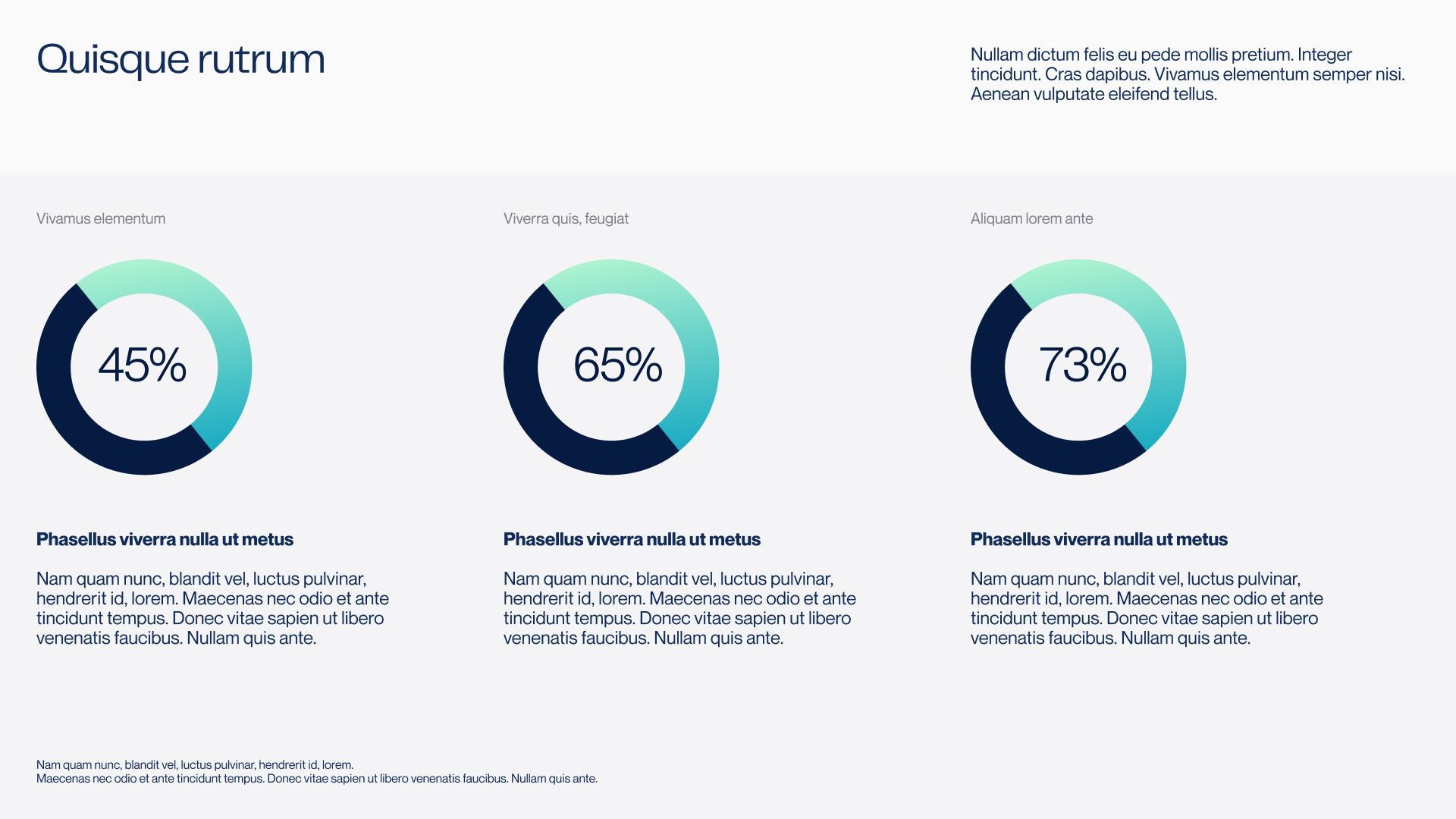
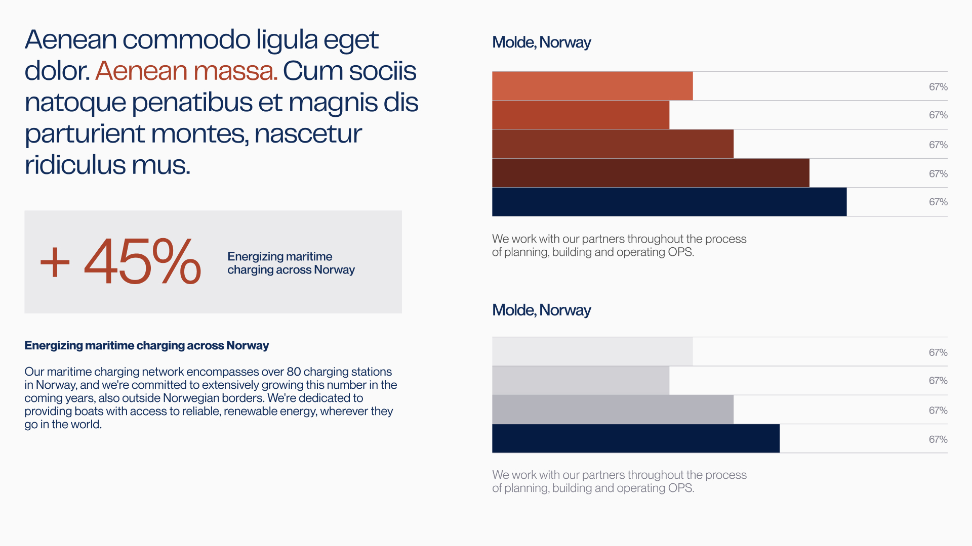
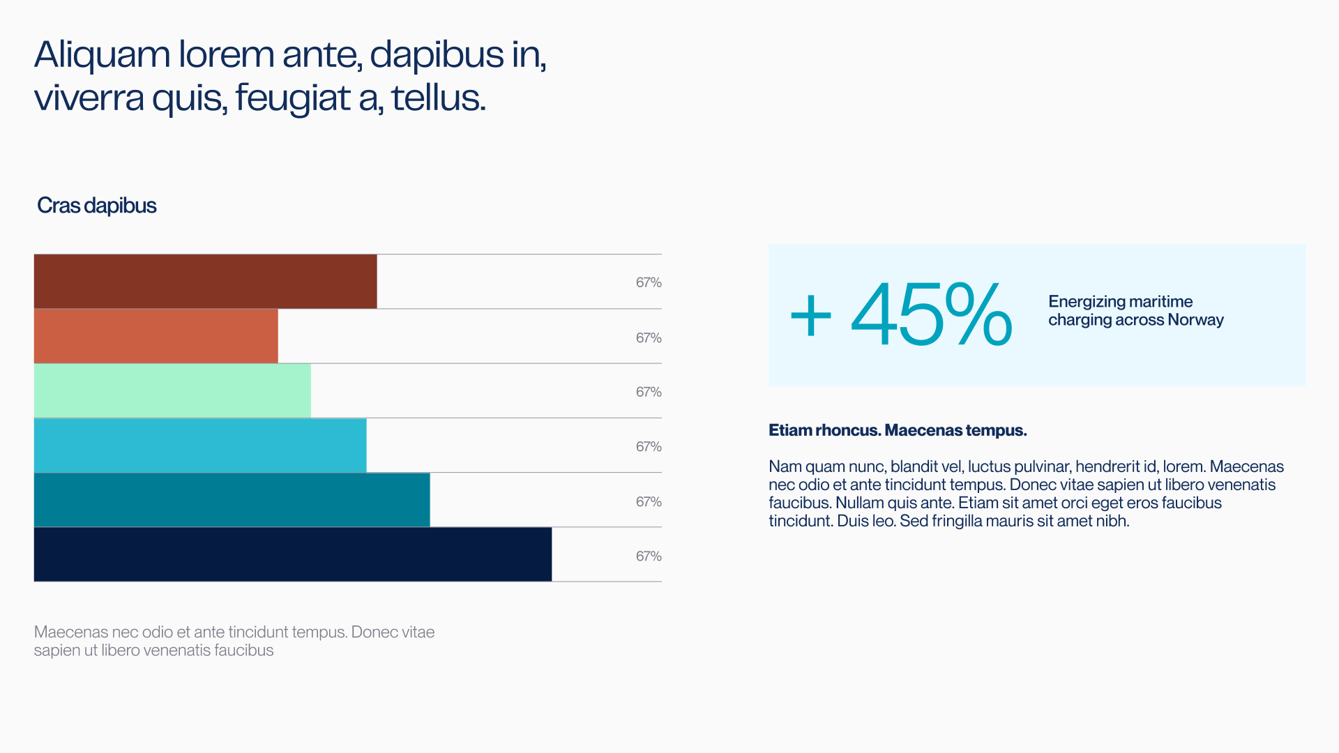
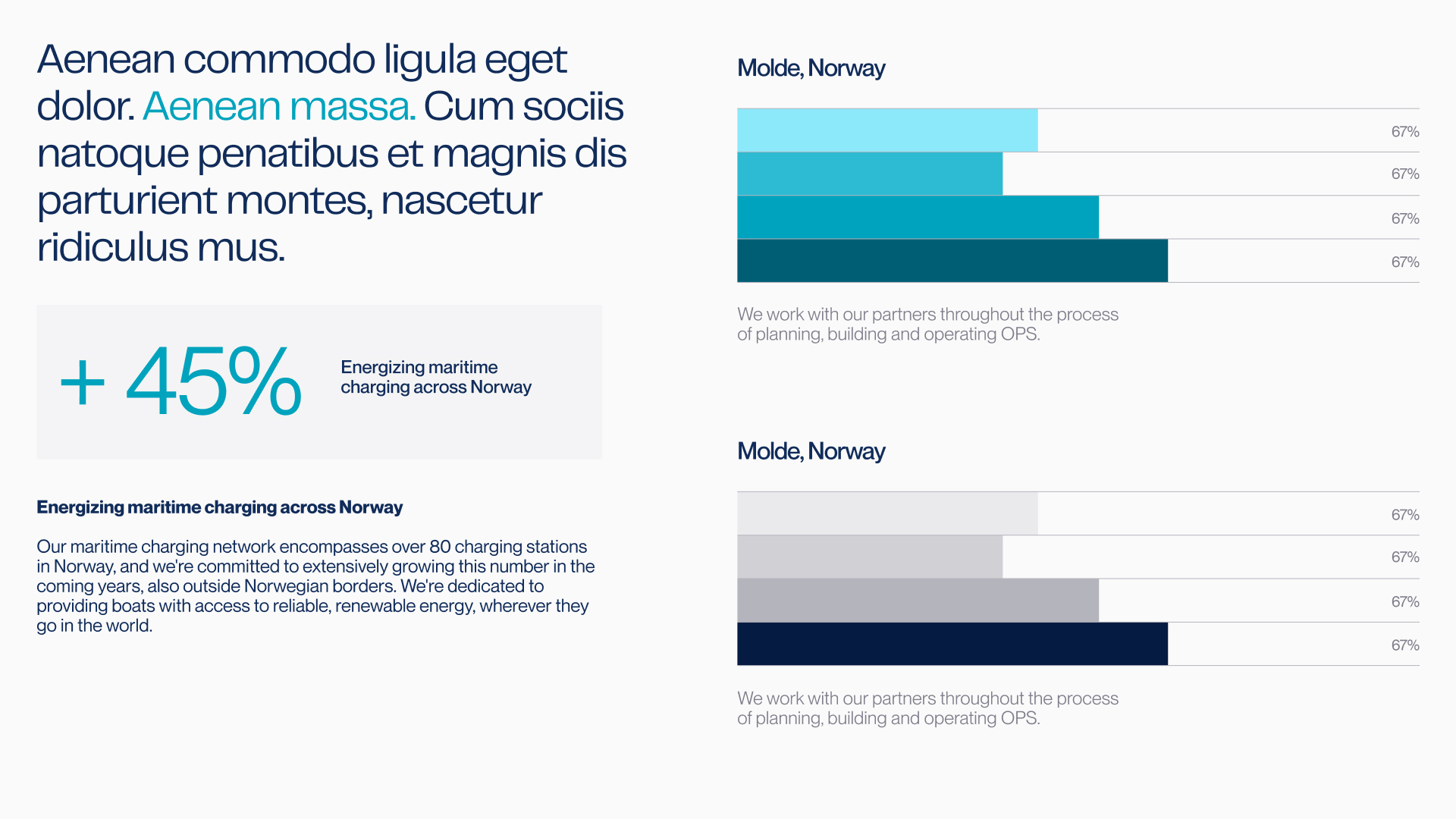
Presentation
Presentations should feel structured, confident, and easy to follow.
Layouts must support clear storytelling, with strong hierarchy and generous spacing. Headlines should be concise and factual, supported by visuals and data that reinforce the message.
Avoid overcrowded slides or decorative elements. The goal is to explain complex infrastructure and long-term projects in a way that feels understandable, credible, and grounded in real operations.
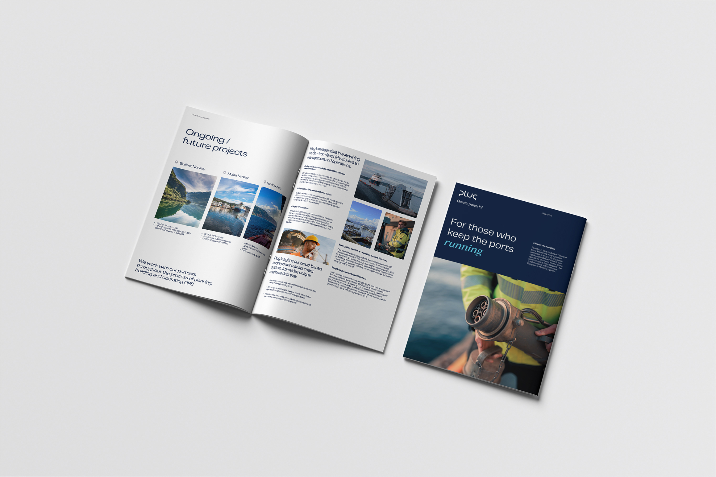
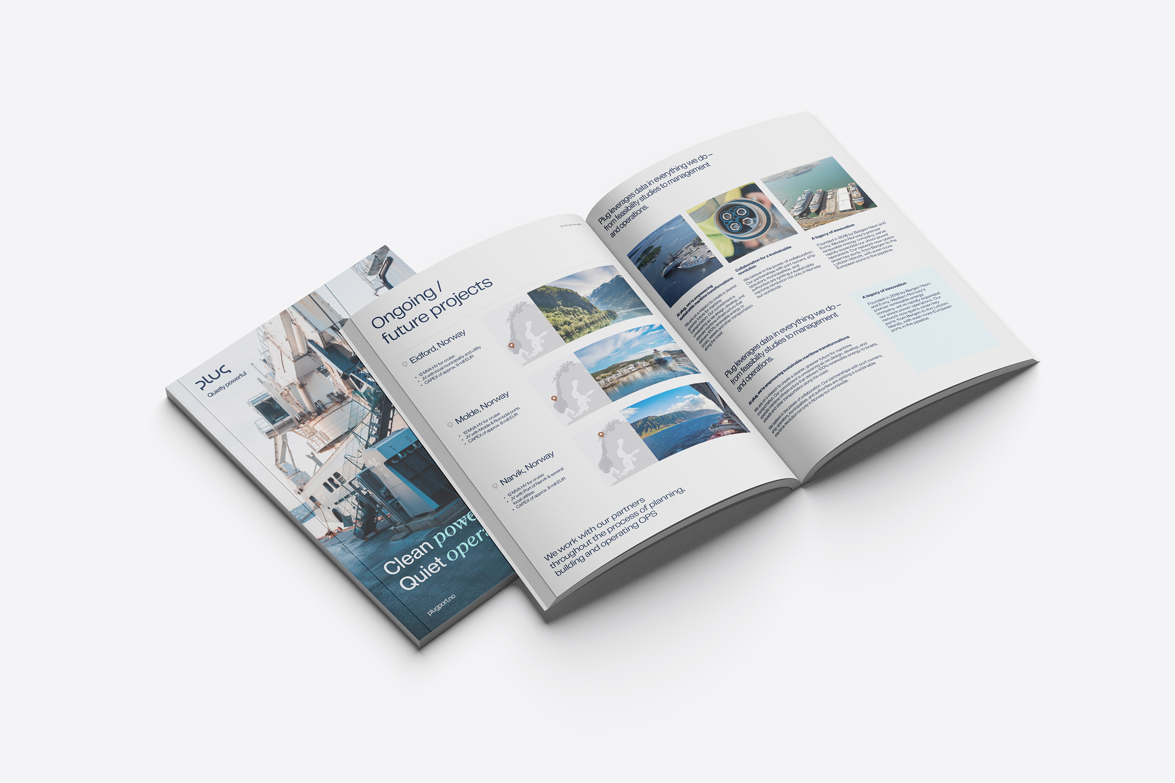
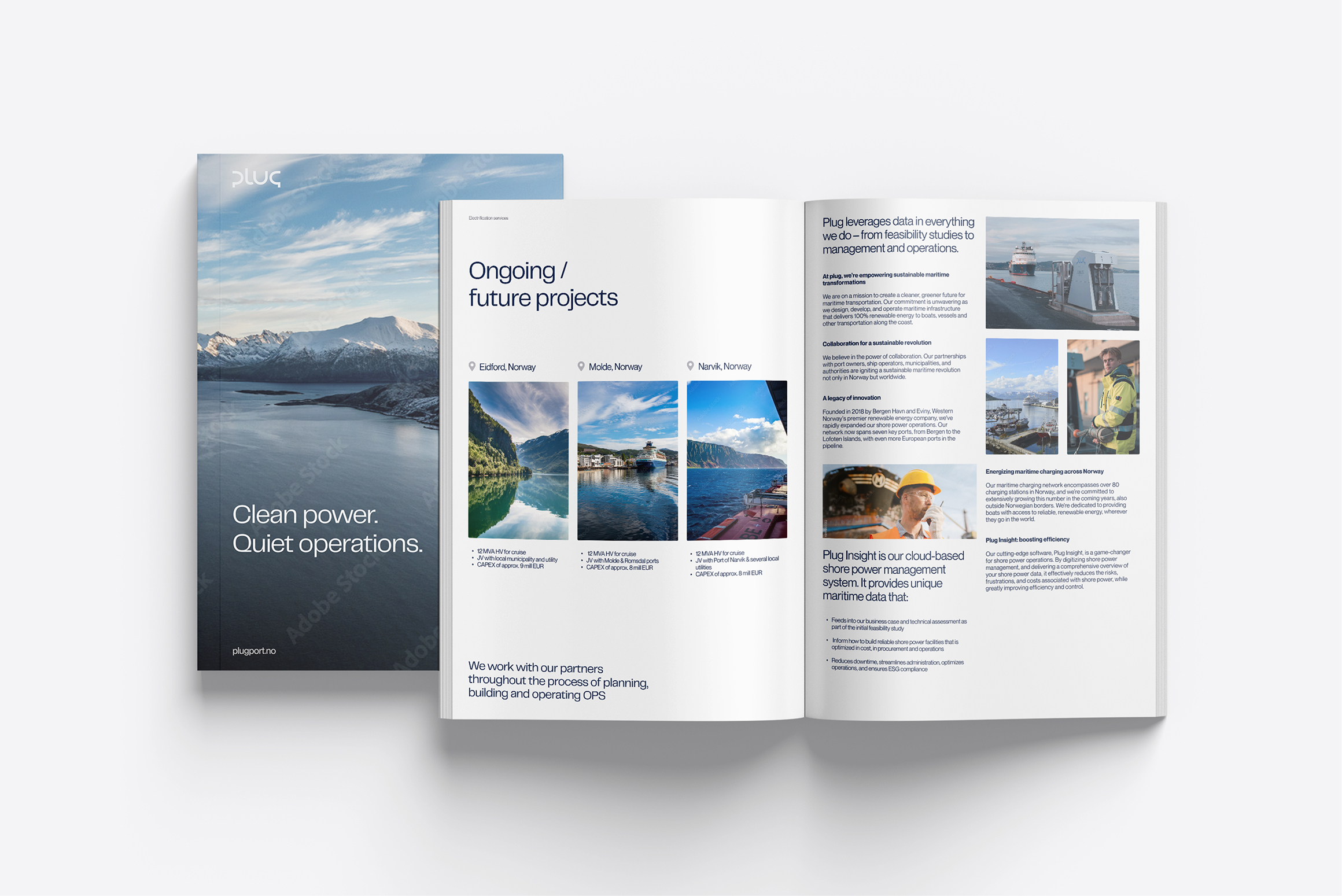
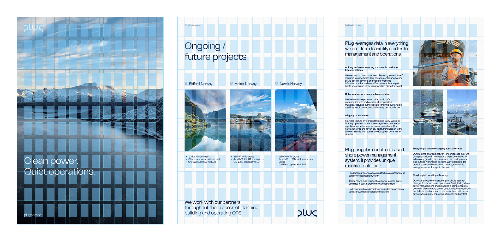
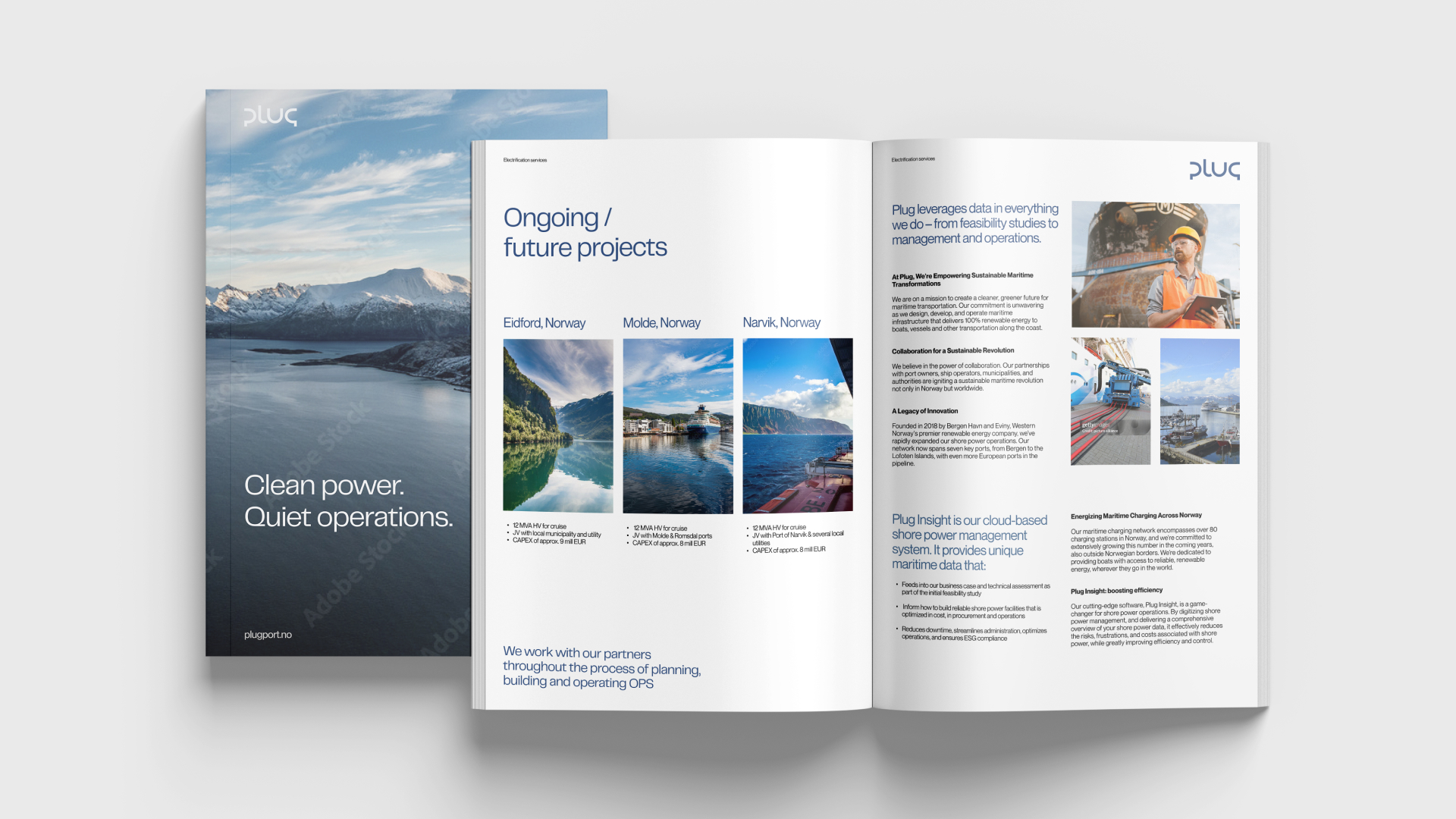
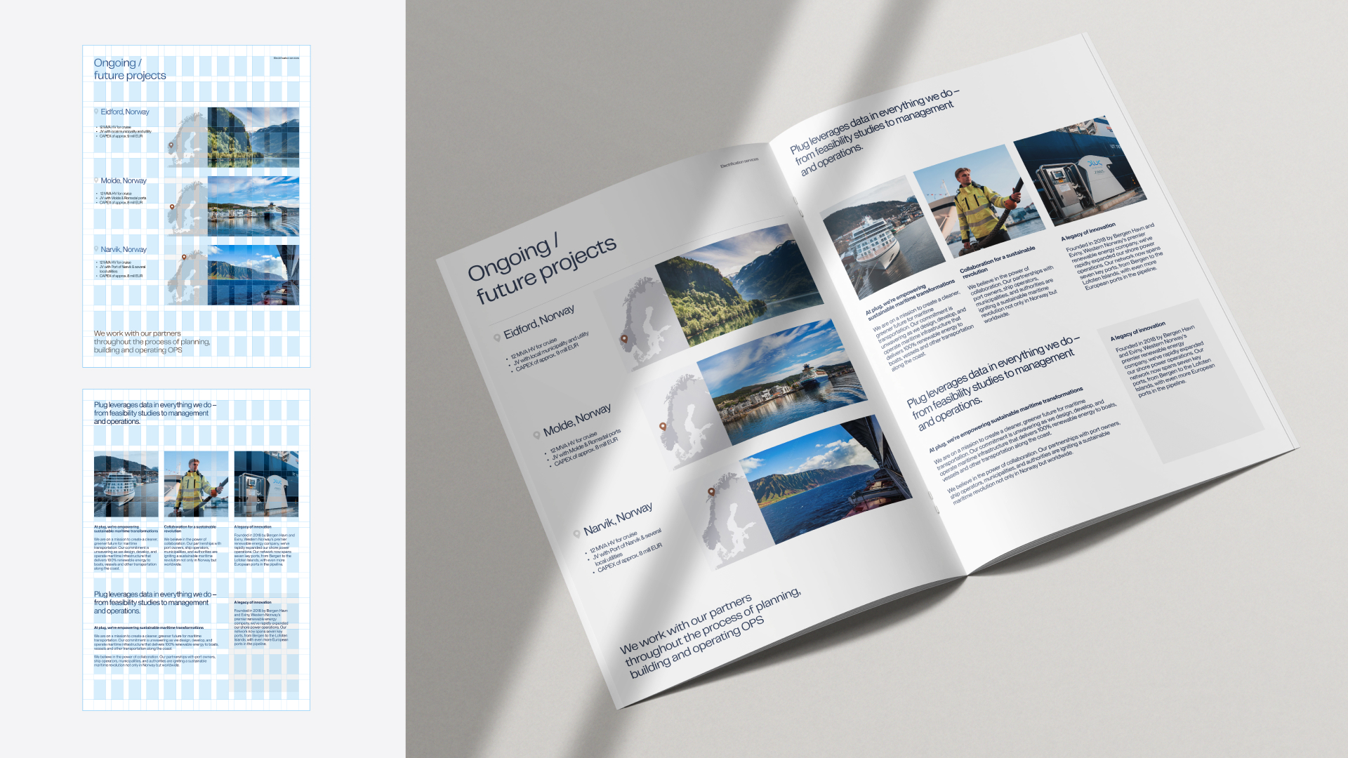
Brochures
Brochures should communicate depth, stability, and long-term commitment.
Layouts should balance text and imagery carefully, allowing readers to absorb information at a steady pace. Headlines should be clear and informative, supported by concise body text and relevant visuals.
Use color sparingly to guide attention, not to decorate. A calm and consistent layout builds trust and reinforces Plug’s role as a long-term infrastructure partner rather than a short-term solution provider.