Typography
Overview
Plug’s typography is designed to support clarity, precision and long term credibility. The type system balances technical readability with a calm, confident presence, reflecting how Plug works in practice: structured, dependable and grounded in real world infrastructure.
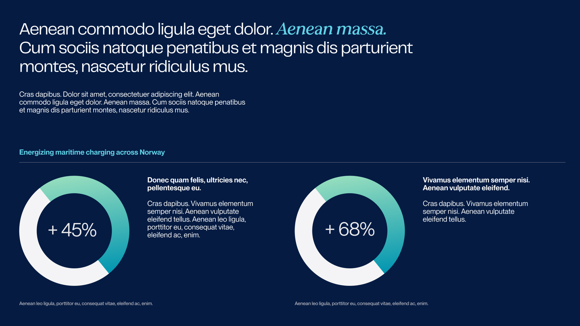
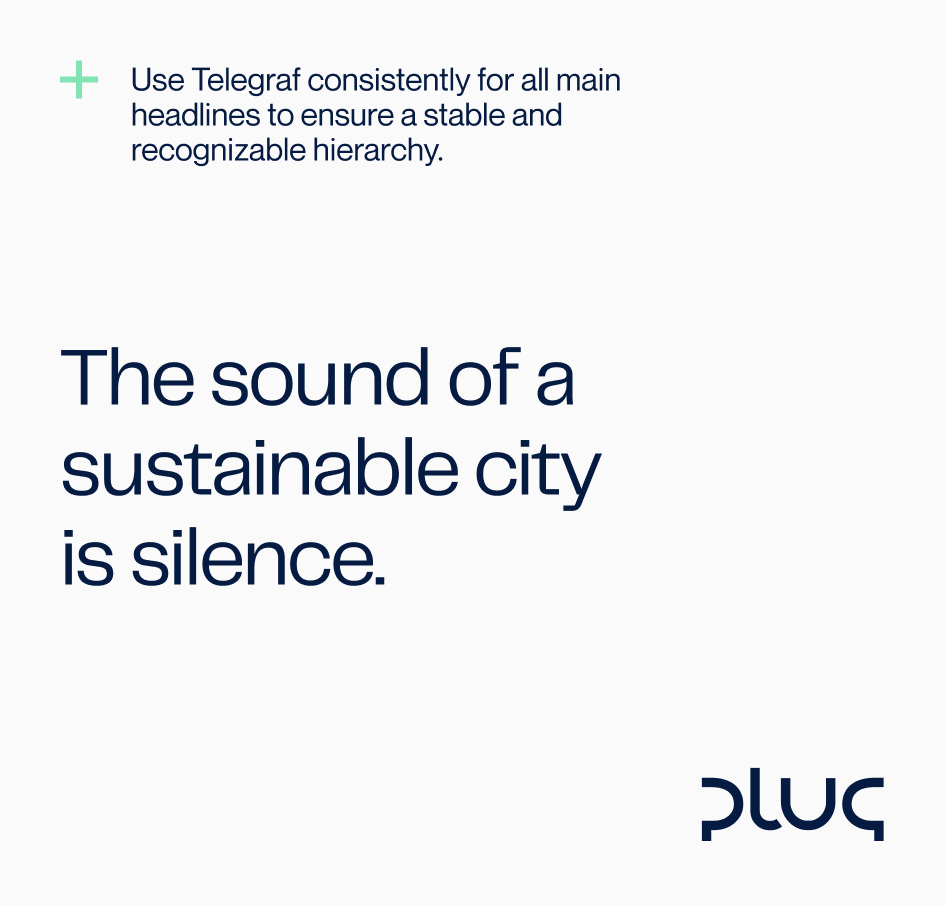
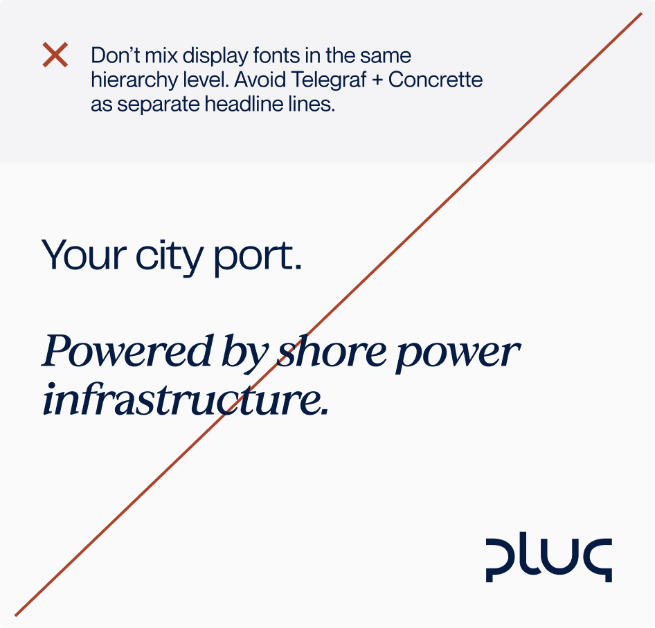
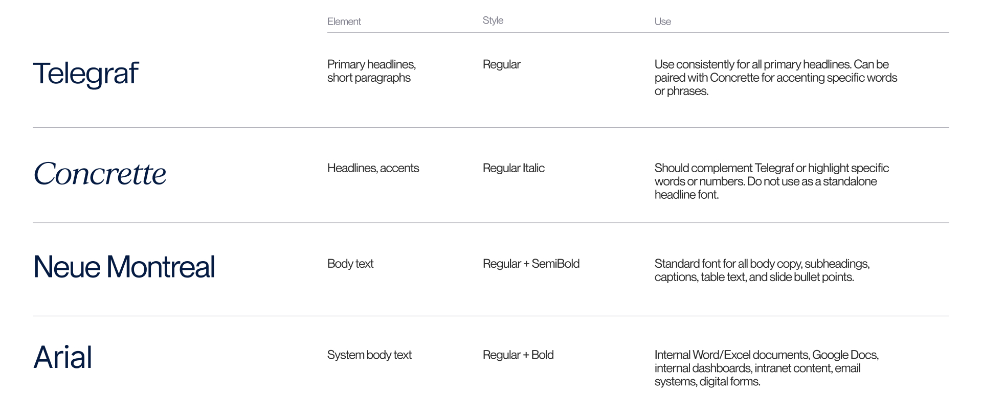
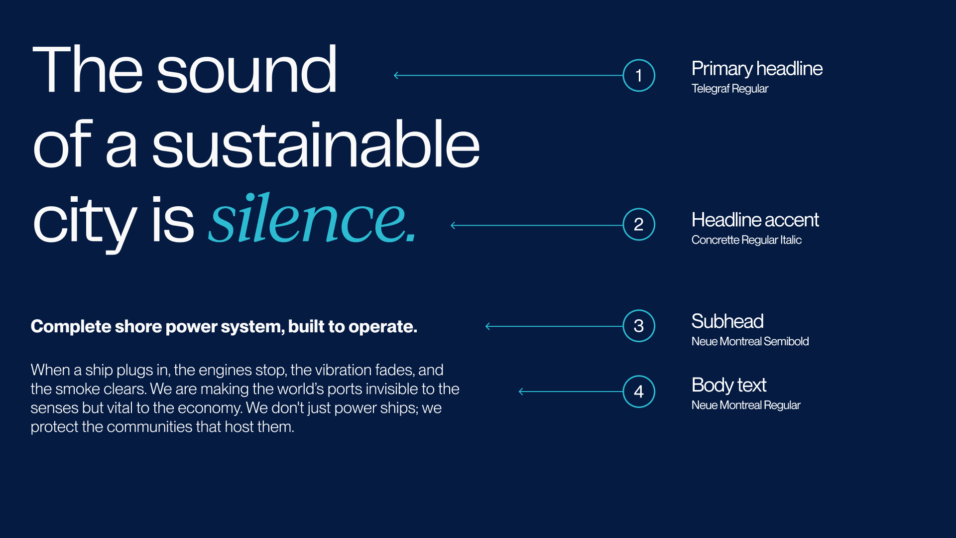
The primary typeface, Telegraf, is used for headlines and key statements. Its industrial, modern character feels technical without being cold, and authoritative without becoming dominant. It gives Plug a clear voice that feels stable and deliberate rather than expressive or promotional.
The secondary typeface, Neue Montreal, is used for body copy, subheadings and functional text. Its neutral structure ensures excellent readability across longer texts, technical explanations and digital interfaces.
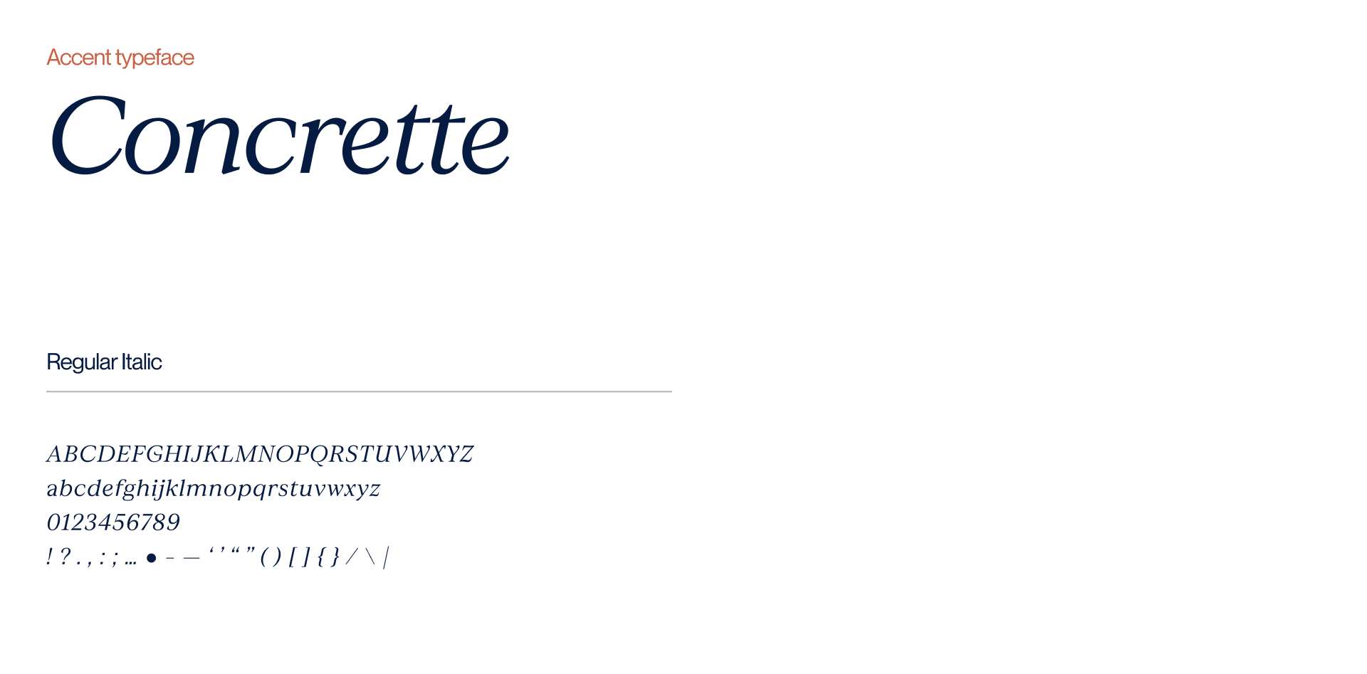
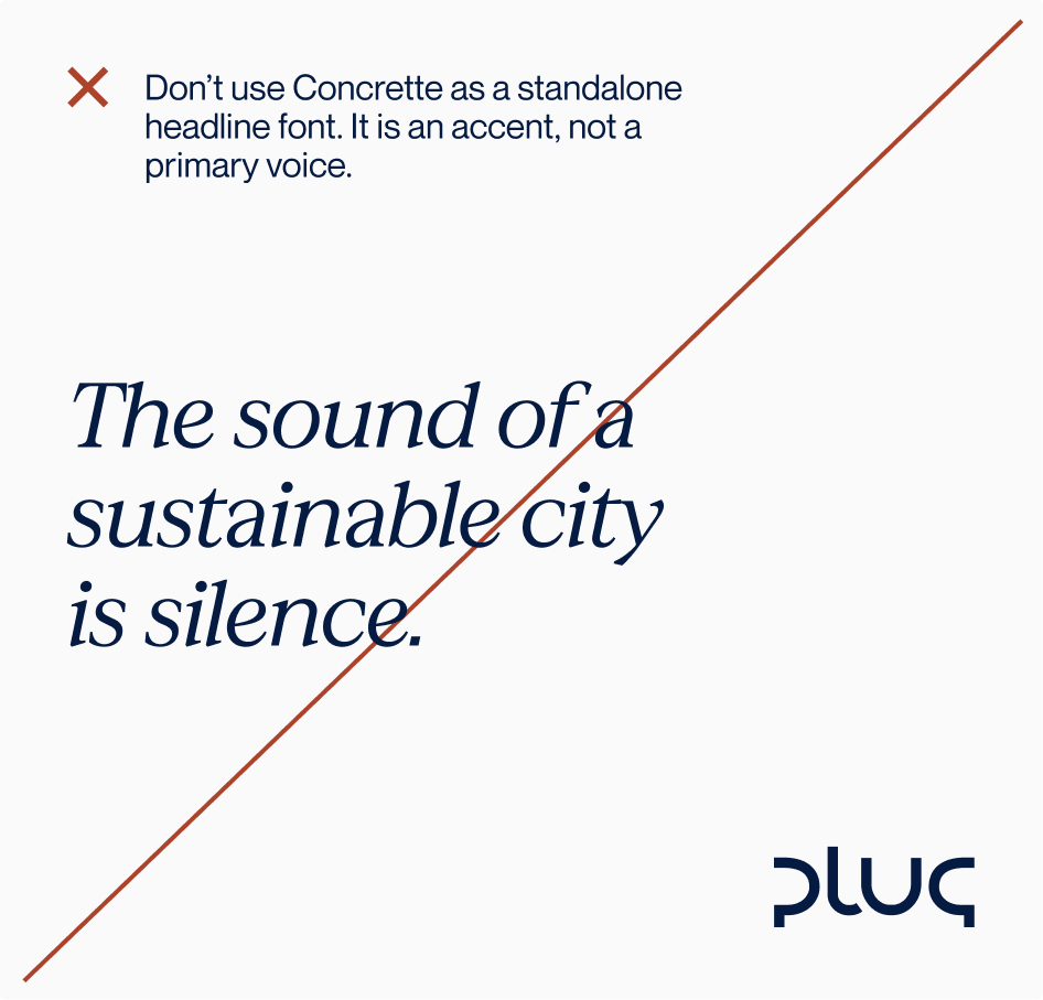
Concrette M is used selectively for highlighted words or emphasis within key statements. As an italic serif, it introduces a subtle contrast to the primary system. It adds depth and nuance without shifting the tone. Its presence reflects continuity and heritage in a restrained way, acknowledging Plug’s roots while remaining forward looking.
Together, the three typefaces create a typographic system that feels precise, calm and trustworthy across all touchpoints.

Telegraf typeface is used for all primary headings. It defines the main typographic expression of the brand and provides clear structure and emphasis at the highest level of hierarchy.
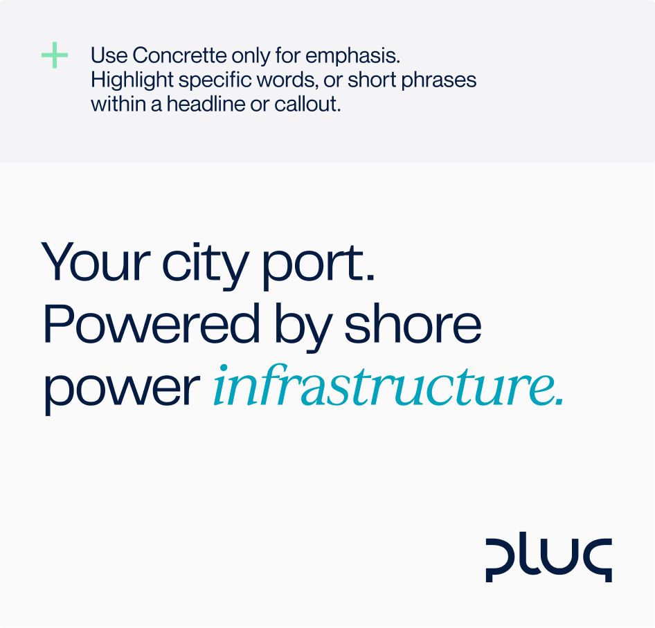
Concrette is used to introduce emphasis and distinction. It is applied primarily within Telegraf headlines to accent individual words or phrases. It may also be used for isolated emphasis such as pull quotes, statistics, or short callouts.
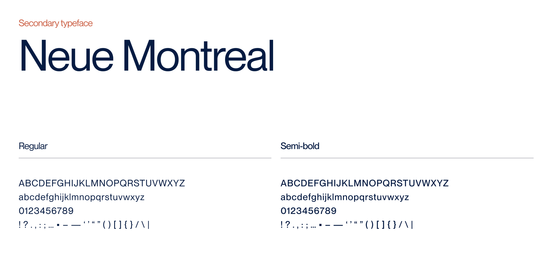
Neue Montreal is the standard typeface for all content below headline level. It provides a neutral and highly readable base for extended text and structured information across all formats.
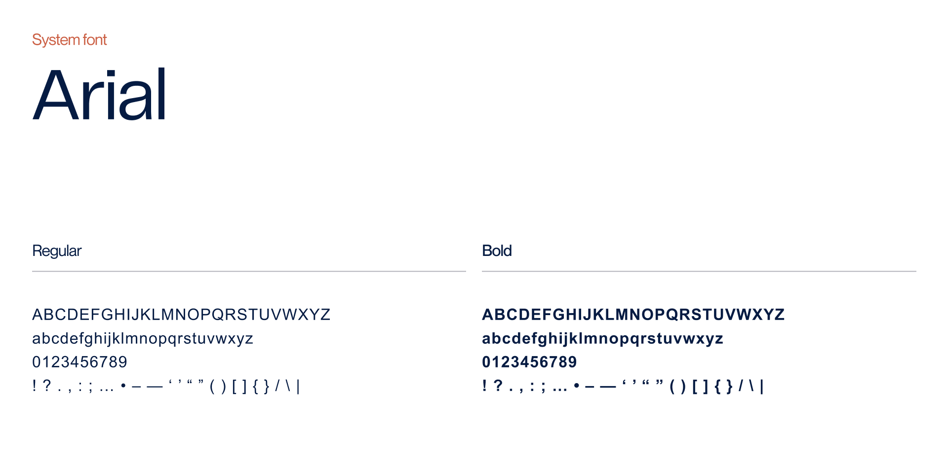
Arial is used in tools such as Microsoft Word, Excel, Google Docs, email systems, intranet platforms, dashboards, when the brand font use is not possible. It should follow the same hierarchy and weight logic as Neue Montreal and Telegraf.
Weights
The Plug typography system uses a limited set of weights to maintain consistency, clarity, and restraint. We avoid unnecessary variation and rely on hierarchy, spacing, and contrast rather than heavy weights.
Neue Montreal is primarily used in Regular for body copy and longer texts, with Semibold used selectively for subheadings and emphasis where additional clarity is needed. This ensures readability without adding visual noise.
Telegraf is used exclusively in Regular for headlines and key statements. This keeps the tone calm and authoritative, avoiding the aggressive or promotional feel that heavier weights can introduce.
Concrette M is used sparingly as an accent within headlines, never as a primary reading typeface. It is intended to add subtle emphasis, not decoration.
Body Copy, Short Paragraphs, Subheaders
Neue Montreal regular and semibold
Headlines, Short Paragraphs
Telegraf regular
Headlines, Accents
Telegraf with concrette
Type application
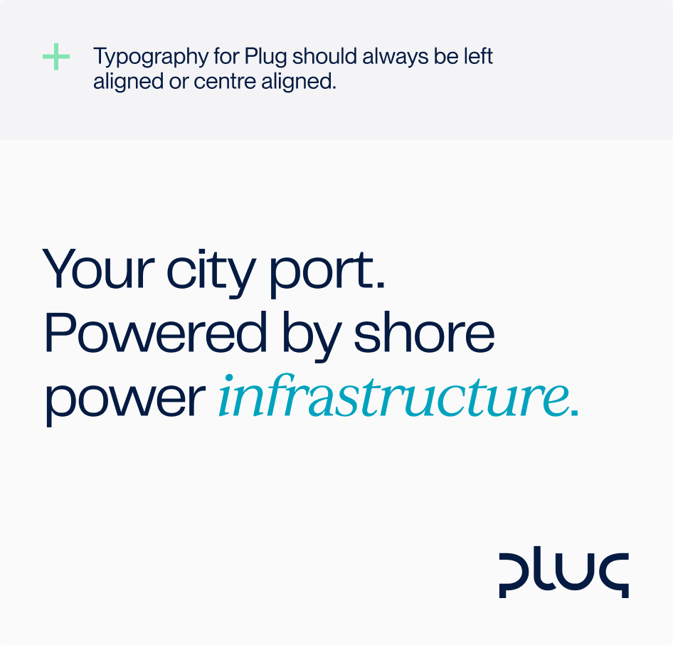
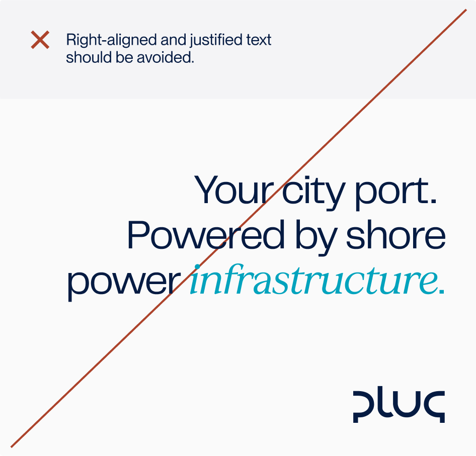
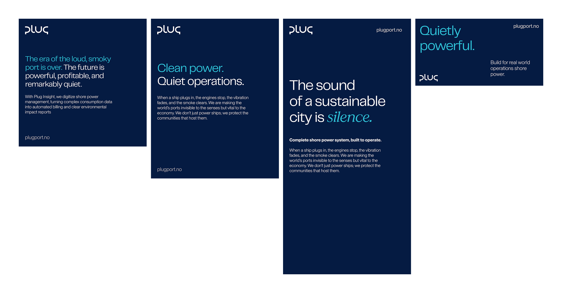
Plug typography should be aligned left or centred. These alignments support clarity and create a calm visual rhythm that reflects how Plug communicates and operates.
Right aligned and justified text should be avoided. They introduce uneven spacing and unnecessary visual tension. Simple alignment keeps the focus on the message rather than the layout.
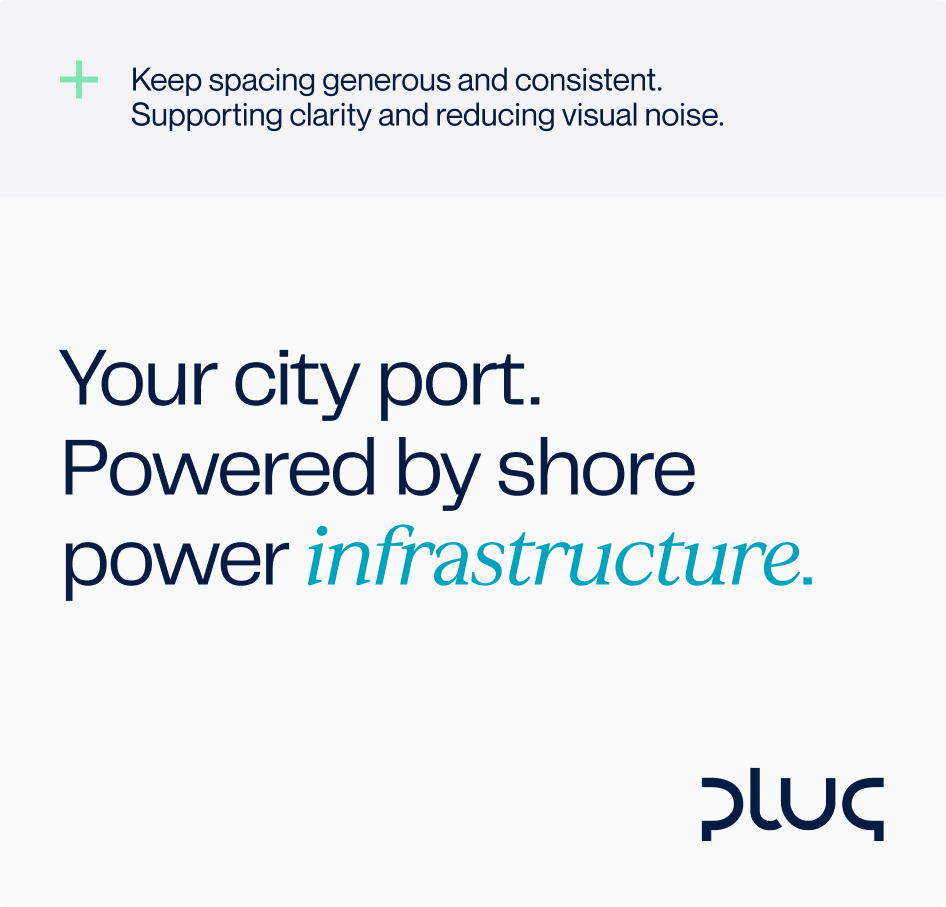
Consistency is essential. Alignment, spacing and hierarchy should feel controlled and deliberate across all formats. Typography must support structure, not compete with it.
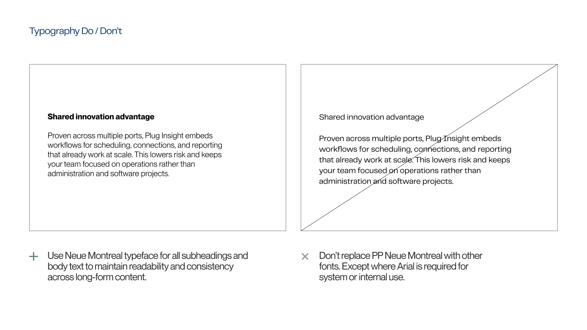
Do’s
Dont's
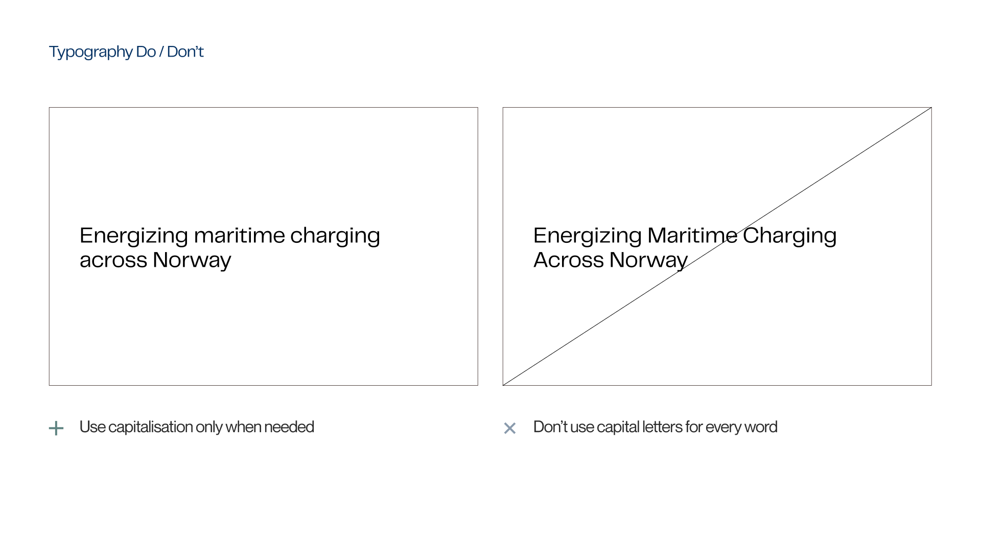
Do’s
Dont's
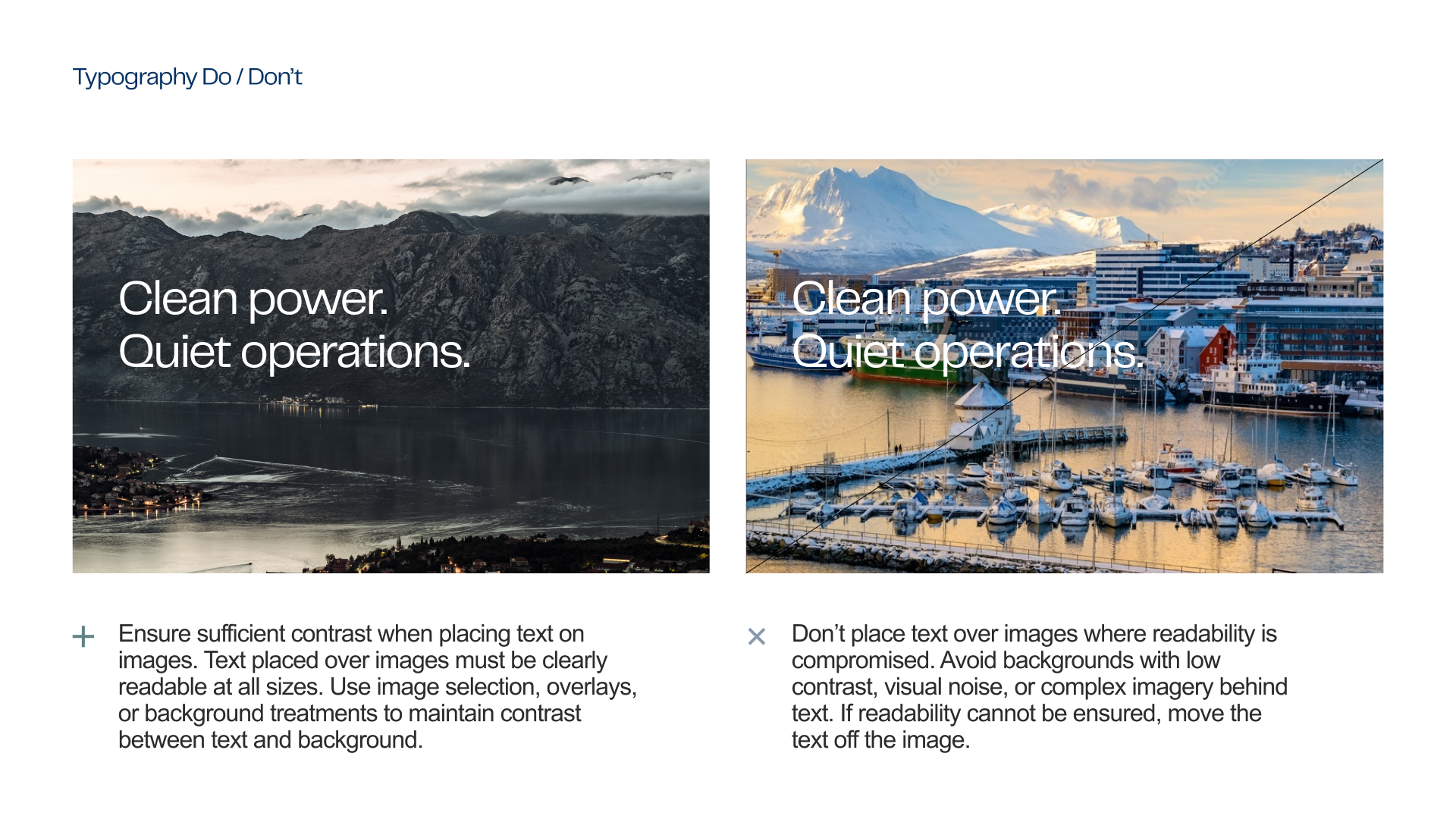
Do’s

Dont's
Do’s
Dont's
Type Hierarchy
Clear hierarchy makes complex systems easier to understand. Plug uses typography to guide the reader calmly and confidently, without visual noise or competition between elements.
We limit each composition to a small number of type sizes and styles. This creates structure, improves readability, and reflects how Plug works in practice: structured, deliberate, and precise. A consistent hierarchy ensures that key messages stand out, while supporting information remains clear and unobtrusive.
Font size
Font sizes are flexible and should be determined in relation to the format and scale of the material being created. The body copy serves as the typographic baseline and is defined as 100%.
All headings and subheadings should be sized proportionally from the body text, maintaining a clear and consistent hierarchy. Scaling should be balanced and intentional to ensure readability and visual clarity across all materials.
The body copy is defined as 100% and serves as the typographic baseline.
• H1 (Primary heading): 200% - 700%
• H2 (Secondary heading): 140% - 160%
• Body copy: 100%
• Captions / footnotes (optional): 70% - 90%
This scale creates a clear and confident hierarchy, allowing headlines to stand out while preserving readability in longer text. Exact sizes may be adjusted based on format and layout, but proportional relationships should always be maintained.
Headline sizes may be adjusted to influence the tone of the material and to guide how the reader understands the emphasis of the document. Larger headline sizes create stronger impact and hierarchy, while more restrained sizes support a calmer, more informational tone.
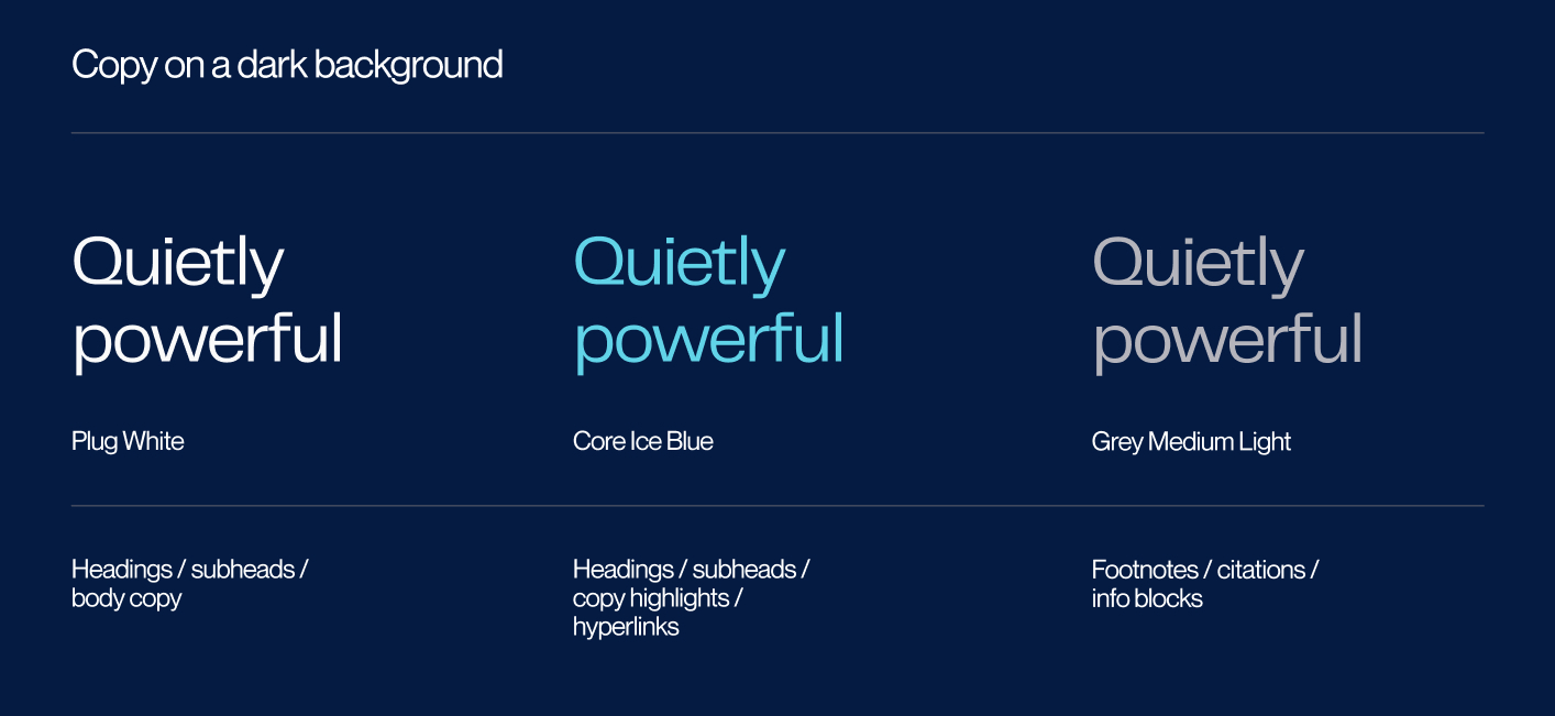
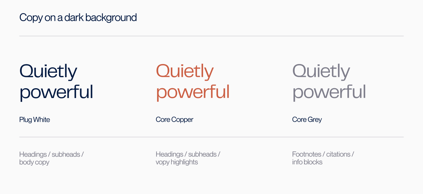
Font color usage
Typography follows a restrained and consistent color system. Color is used to support hierarchy and emphasis while maintaining strong contrast and readability across light and dark backgrounds. It should clarify the message, not compete with it.