Logo
Overview
The Plug logo is the primary identifier of the brand. It should be used consistently and without modification.
Clarity and discipline in logo use strengthen recognition and trust over time. The logo reflects how Plug operates: structured, precise and dependable. It is intentionally simple and should not be enhanced with effects, decorative elements or reinterpretations.
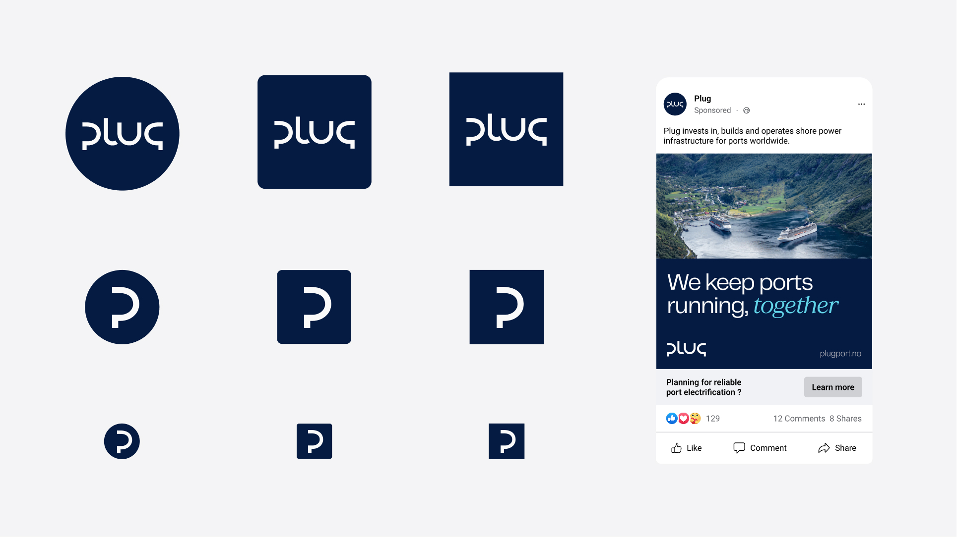
This section defines how the logo is used, scaled and positioned to ensure a clear and coherent brand expression across digital and physical environments. The logo system consists of:
• A primary horizontal version
• A secondary vertical version
• Approved sub logo configurations
• Simplified icon formats for small scale use
Only approved logo files may be used.
Do not recreate, redraw or alter the logo.

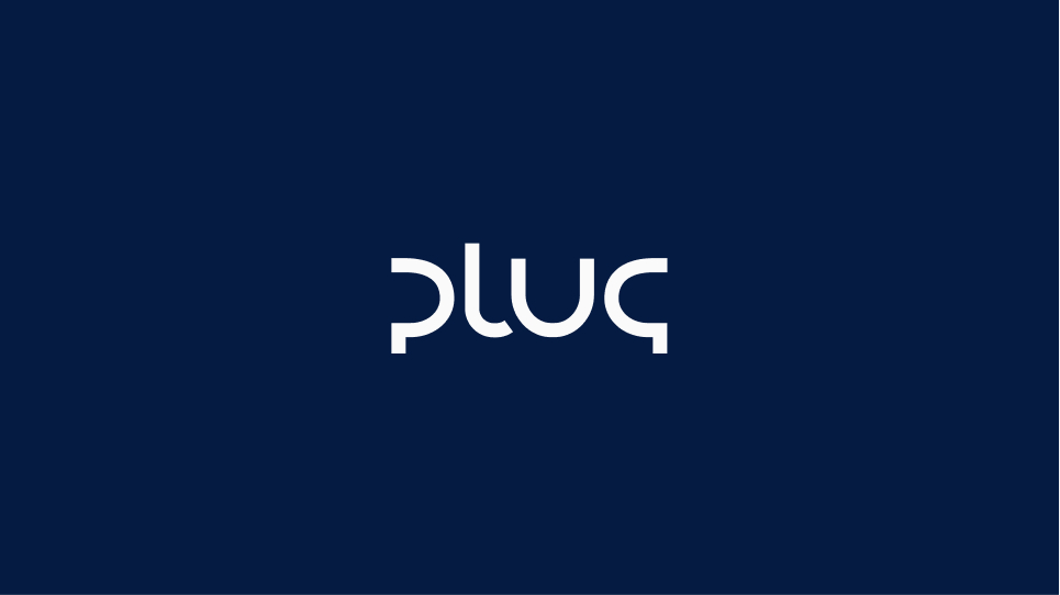
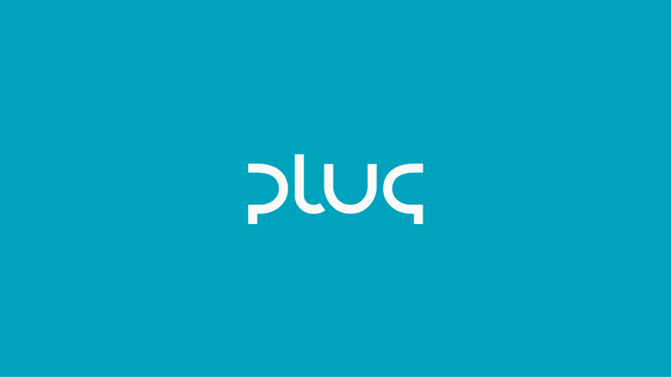
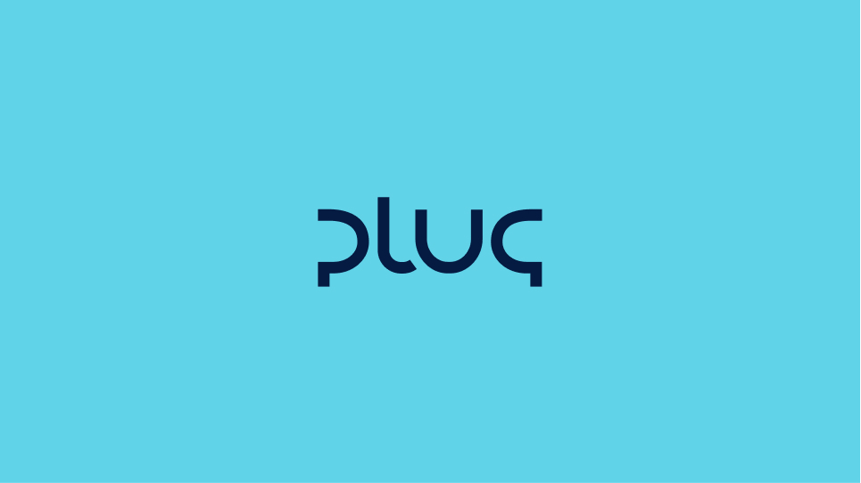
Logo on colors
Negative

Negative with sub-name
Negative
Positive
Negative

Negative
Positive

Positive with sub-name
Clearspace
To preserve clarity and visual integrity, the logo must always be surrounded by sufficient empty space. No text, images or graphic elements should enter this area. Clearspace ensures the logo remains calm, legible and visually independent in all applications.
The minimum clearspace around the logo is defined by the height of the “P” in Plug. This measurement applies on all sides of the master logo and sub logo configurations.
Space between logo and sub name
When used with a descriptor such as Shore Power, Insight or Bergen, a protected vertical space must remain between the Plug logo and the sub name.This space is part of the logo system and must not be reduced, expanded or filled with graphic elements. The sub name should always:
• Be aligned according to the approved lockup
• Respect the defined spacing ratio
• Never touch or visually merge with the main logo
The descriptor is subordinate to the master brand. The spacing ensures clarity in hierarchy and legibility at all scales. No additional lines, graphic elements or decorative separators may be introduced between the logo and the sub name.


Placement & scale
The logo must always be positioned within one of the defined layout zones.
Consistent placement creates a recognisable structure and ensures flexibility across formats while maintaining a unified brand expression. PlacementThe logo should align to the grid system used in the layout. It must never appear randomly placed or visually floating.Approved placement zones:
• Top left
• Bottom left
• Top right
• Bottom right
The logo should always align to grid intersections or defined margin boundaries.
It must not be centred unless specifically defined in the layout template. The logo must never overlap with images, text blocks or graphic elements. It should remain visually anchored and structurally integrated into the composition.

Logo on a grid system - correct application
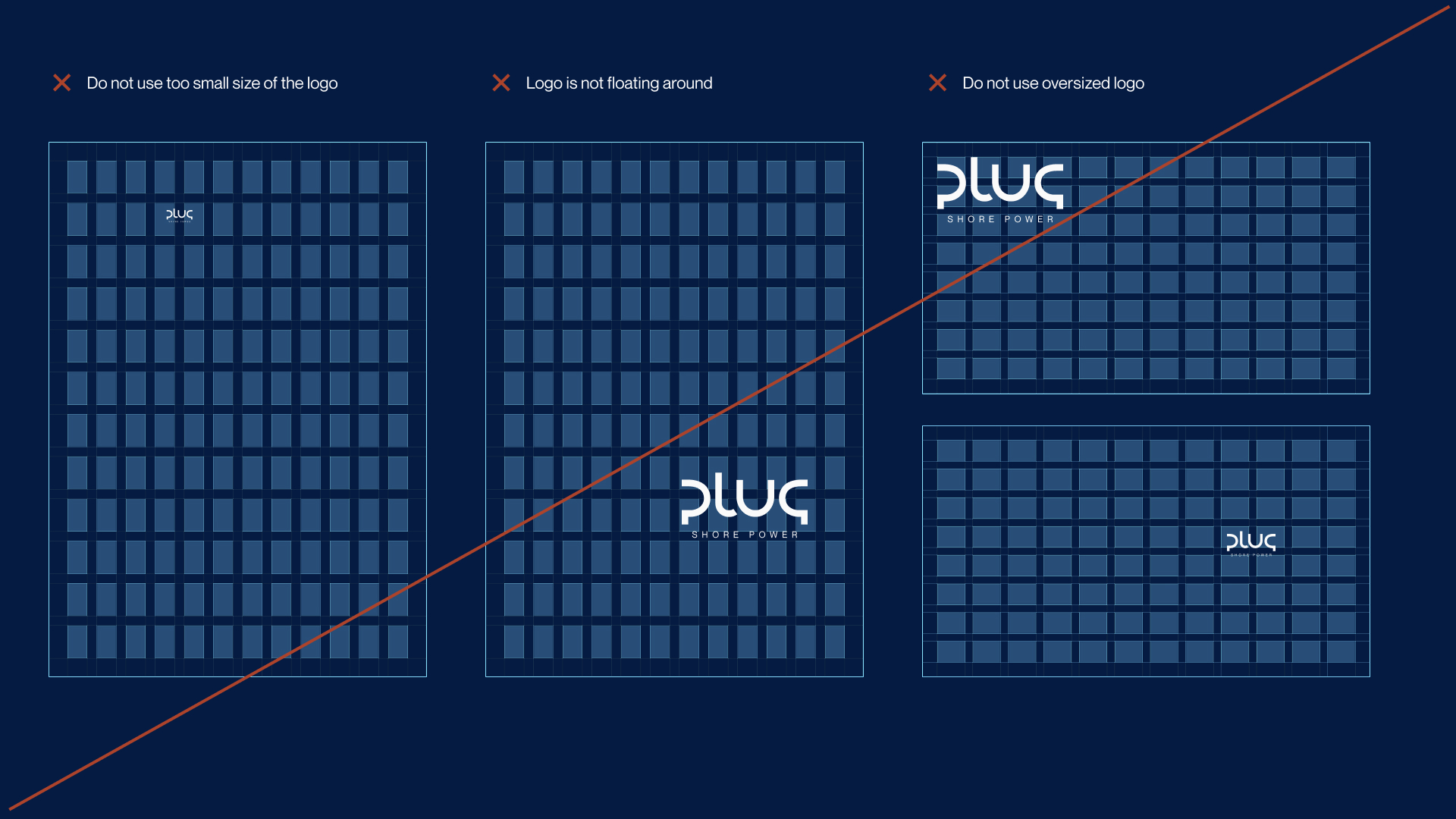
Logo on a grid system - missuse
Misuse
The logo must always appear as designed. It may not be altered, decorated or reinterpreted. Do not stretch, rotate, outline, recolour, add effects or modify proportions. Do not place the logo on visually noisy backgrounds or inside shapes that compromise clarity. The logo is a fixed asset. Only approved versions from the official logo set may be used.
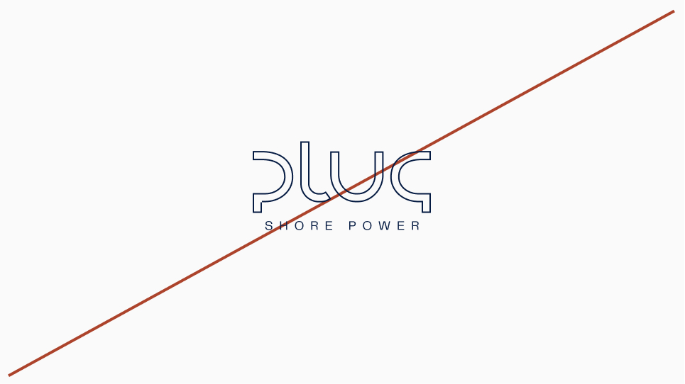
Outline
Disproportionate resizing
Gradient
Low contrast

Drop shadow
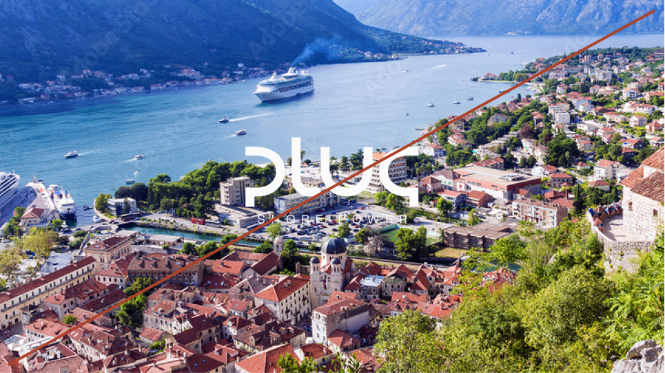
Low contrast on image
Logo icon
Plug does not have a standalone logo icon. The primary brand mark is the full Plug logo. Whenever space allows, the full logo should be used. The wordmark is short and designed to function clearly at small digital sizes, making a separate icon unnecessary in most applications.
Exception for very small sizes
In cases where the full logo becomes illegible due to extreme size limitations, such as favicons or very small app icons, the “P” from the Plug logo may be used as a simplified mark. This usage is restricted to:
• Favicon
• Very small digital surfaces
• Platform constrained icon formats
The “P” must not be redrawn or modified. Only approved files may be used. The icon version is a technical adaptation, not an alternative logo. Whenever size allows, return to the full Plug logo.
Icons
Plug uses the Phosphor icon system as a structured and scalable foundation. The icons are intended primarily for digital interfaces, dashboards and technical communication. They support clarity and navigation. They are not illustrative elements. Icons should be used at small to medium sizes. When larger visual emphasis is required, use photography or illustrations instead.
Weight
All icons must be used in Regular weight. Do not mix weights. Do not use Thin, Bold or Fill versions. Consistency in stroke thickness ensures a cohesive visual expression across products and platforms.
Styling
Icons must:
• Use approved brand colors
• Maintain original proportions
• Not be modified, redrawn or stylised
• Not be used decoratively or enlarged as graphic patterns
Icons are functional tools. They should remain simple, clear and precise.
If additional icons are required, refer to the official Phosphor library:
phosphoricons.com
Only icons that align with Plug’s tone and technical context should be selected.

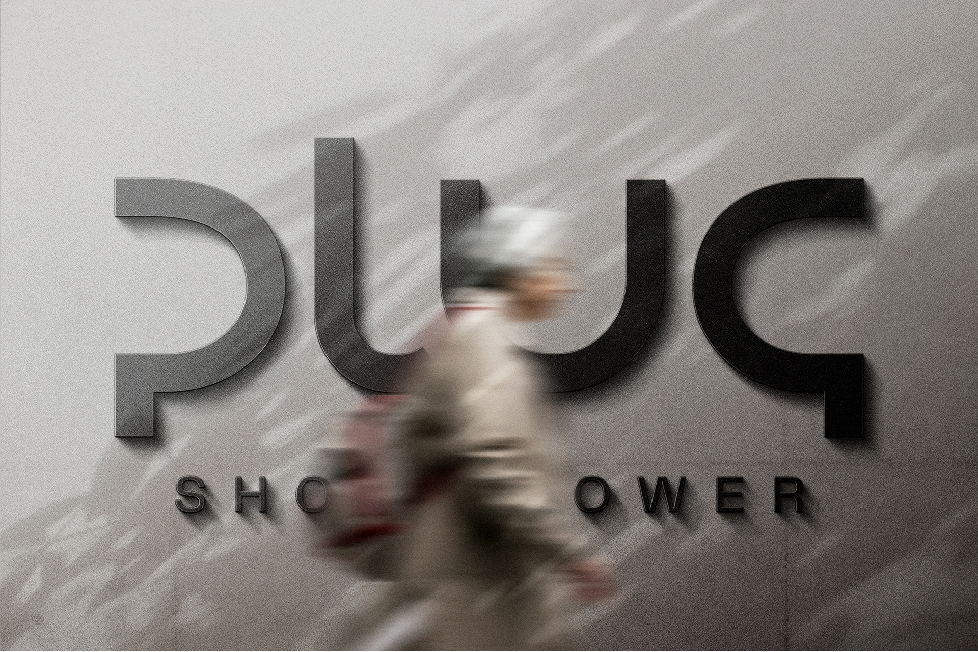
Facade
When the logo is used on buildings or physical installations, clarity and legibility must be prioritised. The logo should be clearly visible from distance and integrated naturally into the architecture, using materials and colours that provide strong contrast and long term durability. Avoid decorative effects, complex backgrounds or treatments that reduce clarity. Facade applications should feel stable, precise and permanent.